Bringing back the dead. Why site stats are important to a blog.

Yesterday was my big brave day and I posted and the world did not blow up and I was not attacked by rabid trolls foaming at the mouth. Today is harder. Yesterday I ran up the steps and jumped off the diving board. Today I have time to ponder about what I did/doing and go “OMG what was I thinking!” along with all the other fun thoughts of self-doubt.

But we shall still push forward! (Deep breath!)

You do have an author site, right? Please. You need an author site. The easiest one to set up is a WordPress site. Let me know if you are interested in learning more about this, or have any questions about WordPress sites you would like answered. I am happy to help!

All WordPress sites come with an amazing little tool called Jetpack. Actually, it is a bunch of tools provided by WordPress and a bunch of them are free. One of which is the Jetpack dashboard Site Stats. This tells you how many people are visiting and can give you a general picture of the health of your site over time.

Something that my stats are telling me is that you liked the Quick Links better than the Link Roundup posts. See how powerful you are! And I am listening because eventually, I would LOVE for this site to kind of be like a neighborhood coffee bar for writers. A place to find resources and hang out. So the quick links will be back but maybe with a link round up on Fridays. There is just too much good content out there. So how about that? And of course, I will still be trying to find my voice and write directly to you. And maybe, just maybe, you will write back to me.

Have a good day!

Paula

Save

Help! I can’t find my voice!

If you have been coming to this site (thank you!) you might have noticed that right now I have been posting links to other peoples stuff. It’s really good stuff, stuff that I find quite helpful, but it is other peoples stuff on other people’s sites. Since my day job is helping other people with their sites and I am pretty darn good at it, I know that original content is key to a sites success. So why the disconnect?

Mostly fear.

I’m just a dandelion!

I am afraid of you. Yep. Little ol’ you.

So afraid, that I hesitate on what to do. Who am I to you? What if you don’t like what I have to say or how to say it? And how do I find my goddamn voice?

I think I just found out that my voice cusses a little bit. Sorry. But it is me.

But I change and so doesn’t my voice. Constantly. Depending on the situation, on my mood, how hungry I am, and just because. I do an awesome evil Elmo voice.

Where does that leave me in terms of finding my voice to speak to you? I don’t know.

But I do know that to do nothing, to continue to be afraid to speak is like losing a little piece of myself.  I know that I am very honest if you are speaking kindly of me, or god awful blunt which is probably closer to the truth. I don’t filter myself very well.

Plus I hate the feeling of being scared and weak more than I hate what scares me.  One summer very long ago, my friends and I were at a pool with a very high dive. My friends were trying to decide if they dared jump off and were trying to rationalize their fear.  The diving board was quite high, used for Olympic training.  They turned around to try and get me to go first, but I was already gone and halfway up the ladder. The trick is not to think about it, just do it. One determined baby step at a time until you run out of diving board.

Perhaps that is the answer. I am going to take a deep breath and hold it in and take a baby step, then another until I run out of diving board. Hopefully, you will stay with me. I am still afraid of you but I am more mad at the fear I have in me.

Have a good day and thank you for reading.

Paula

Save

Save

Editor’s Note: Traveling For A Few Days

76_roo_crossingHi! I am going to be traveling for a few days but I will be back as soon as I land and can find wifi!  I will be going across the international dateline and I am horrible at time change, but I should be back online by sometime Monday(ish?).
Thank you so much for visiting and supporting Publetariat!

Loves!

Paula

Save

Save

Save

Editor’s Desk – You might have noticed some changes….

Thank you to all the people who have stuck with the site! You may have noticed that I have updated the look of the site, and I will be continuing to make little changes in the next few days. I hope you like it, and thank you for your continued patience. This is the first step towards making some changes that I hope will make the site even more useful to authors.

Paula

From The Editors Desk: Update – we have moved to a new server!

smiley-emoticons-face-vector-smart-expression_X1ZqT-_LHello,

Wanted to let you know we have completed the move to a different server as part of the upgrades planned for Publetariat. I believe everything has moved as it was suppose to, but if you notice anything wonky let me know. Hopefully the site will run faster even with some of the changes coming down the road. I am so excited!

And now on to the next step!

Thanks!

Paula

From the Editor – We will be back for regular posting on May 9th

Romantic beach scene. Female and male flip flpp sandals on the beach

Thank you for understanding.  I shall have a tropical drink for you!


: )

Editor’s Desk: Kindle Instant Previews – Allow readers to preview your book on your site. Plus FREE book giveaway!

You may have used Amazon’s previewer tool in the past, where you were able to embed a preview link on your website or blog post. If you had, you will have realized that the widget was starting to show it’s age, didn’t always work the way it was suppose to, or at all.

That has all changed.

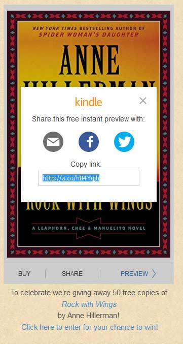
Amazon has updated its Kindle Instant Preview tool and it is wonderful. See below for a sample.

BookGorilla is giving away 50 free copies of
by Anne Hillerman!

 Click here to enter for your chance to win!

Normally $9.99
On sale now $0.99

Beautiful, right?

covers_exampleThere is so much to love. The look has been updated and the embed is mobile ready. Now, people can easily share your book! Add your Amazon affiliate ID during set up, and when they do share your preview, your affiliate link goes along with it. All while on your author site.
At the top of the embed you have the “Buy” button which opens a new window on Amazon to purchase the book. The “Share” button allows people to either email your preview, post on Facebook,  or tweet on Twitter. They even have a short link that can be shared anywhere, which includes your affiliate link. The bottom section lets you know how much of the free sample is left and will allow you to adjust the font size. Very helpful for small screens!  On computer or tablets, if you click on the “Preview” link, the sample is opened as the same size as the image. However, if you click on the text, it will toggle the bottom options and allow you to view the sample full screen.

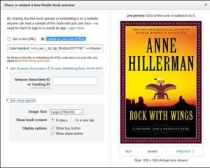
Amazon_reader_3The best part is that Amazon has made this so very easy to set up. First find your book on Amazon. On the right side of the screen, by the share buttons is the <embed> link. Click on that embed link and customize.  You have a choice to create a link that will go to the opened preview pane on Amazon, or the ability to “Embed on your site (HTML)”. Here is where you add your Amazon affiliate tag, and make other customizations such as the size of the image.
Not every book may be available, but so far I haven’t found one that isn’t. If you are already selling the your book(s) directly yourself,  this may not be an ideal option for you. But for many authors, the pain of having to deal with setting up a store to deal with purchases makes this a wonderful alternative. See Amazon for more details.

~ * ~

If you liked this article, please share. If you have suggestions for further articles, articles you would like to submit, or just general comments, please contact me at paula@publetariat.com or leave a message below.


Editor’s Desk – A Cover Is Worth 1,000 Words. 10 Tips To Make Your eBook Cover Awesome.

Please note that while this article is targeting eBooks, there are still some great tips for print covers. However, print covers are more complicated and will be addressed in a future post.

You are not suppose to judge a book by it’s cover, but that is exactly what people do. In the post Categories, keywords, Amazon, and you. How to get the most out of your choices  I showed you how to use categories and keywords to help your book rank higher in Amazon’s search. Now that your book is showing up in front of more potential buyers, you need to make sure you grab their attention. How? With an awesome cover.

You need awesome, because there are a lot of other books competing with yours. You have about 6 seconds to grab potential customer’s attention, and let them know that their next great read is your book.

There is a lot of information that goes into a great cover: color theory, font choices, layout flow, and more. If you can, you should hire a professional. If you can’t hire a professional, don’t use MS Word to create your cover. Use a better program such as Canva, which is free, and will at least give you an option of professional layouts. Either way the tips below will help you.

  1. Goodreads ScreenshotSize – A good cover will look great even in thumbnail size. Readers should still be able to get the gist of the book and at minimum be able to read the title. A lot of dedicated eReaders are in grayscale, so make sure you check that your cover works for them.  The ideal height/width ratio is  8:5 (1.6). See the screen capture of the recent book list I got from Goodreads on the right for some examples.
  2. KISS (Keep it simple silly) –  Simple is better, especially if you are designing your own cover. A simple design sizes better and is easier to convey information to the reader. This doesn’t mean your cover needs to be boring, far from it. A simple design can be very powerful. Covers with more details need careful handling, and are best managed by a professional. You don’t want to overpower your reader or loose the essence of your story with too many details.
  3. Title – Make it stand out. This means good space around the title, a readable font, and a good size.If you have a long title, take the best part and make it the focus. Have the less important parts be, well, less important. For example:
    THE AMAZING TRUE STORY OF BELA LUGOSI AND HIS WONDER RACING LLAMAS: PART ONE – BELA LUGOSI IS ALMOST KILLED AS A CHILD BY A RUNAWAY RACING LLAMA (PART 1 IN THE RACING LLAMAS SERIES!)

    It is a bit much for a cover. The eye is overwhelmed. Try instead:

    The Amazing True Story Of Bela Lugosi
    And His Wonder Racing Llamas
    Part One –  Bela Lugosi Is Almost Killed As A Child By A Runaway Racing Llama
    (Part 1 In The Racing Llamas Series!)

    The bold part is still long, but it gets the title and general story across. The rest can be moved to other areas of the cover, breaking up the text into nice bite size bits. Notice the natural breaks, which happen where there is punctuation. Each section can stand on it’s own.

  4. Story – Does your cover convey a general sense of what your story is about and the genre? Your graphics should match the mood and fit your story. If your story is a regency romance then having a woman on the cover in a modern slip dress doesn’t fit, no matter how breathless and heaving her bosoms are.
  5. Invest – Resist the temptation to be cheap. It is OK to want the best value for your dollar, but I guarantee I can spot your MS Word clip-art a mile away and so can potential readers. If you go to a site where you can hire someone cheaply, be aware that they are probably working off a template. Your cover will look a lot like a bunch of other ones. There are places where you can get good images or artwork for a decent price. A true professional will take time to understand your story and make the cover match.
  6. Image Effects – There are a lot of fun tools you can play with to create rainbow gradients, text outlines, and embossing effects. Go nuts and have fun! Then delete all the effects and put those tools away.
  7. Color – Most website’s backgrounds are white. So if your background color is white, you will fade away. Even using a few shades different from white will make a big difference. Don’t use a big black frame to fix this.
    Your cover will look better if you use color judiciously. This doesn’t mean that you have to use boring colors. If you use colors that are harmonious with each through color theory, it will be more pleasing to the reader’s eye. There are tools that will help you pick out a palette of colors that looks good together. I like the one at Adobe. It is free.
  8. Fonts – Fonts are like spices. A few mixed together is yummy, too many a disaster. Pick two or at most three that look good together and stay with them. Google Fonts are free and offer a wide variety of choices. Make sure you pick one that matches the mood of your story, but is not so fancy it can’t be read. If you have one “decorative” font, pick a simpler one to match. Avoid Comic Sans or Papyrus like the plague. No seriously, don’t use them – ever.
  9. http://ecx.images-amazon.com/images/I/41MLd2DZYwL._SX312_BO1,204,203,200_.jpgFlow – The eyes can only look at so many things at once. Your layout should be set up to guide the reader to the main points you want to convey. You can use position, size of elements, and even your graphics to lead the your reader down the path that communicates your story.
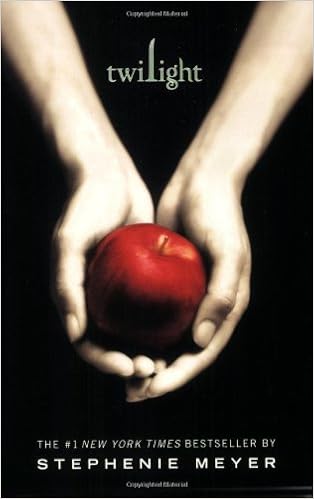
    Symbolism can be very powerful. Instead of using a literal part of your story as the cover, use symbols to convey the main point or mood. This attracts your reader but can also leave a little mystery to the reader. No matter how you feel about the story, The Twilight books by Stephenie Meyer, have wonderful covers that use symbolism in a very powerful way.
  10. Review – Have someone you trust look at your cover. Someone who will tell you the truth. Then get a second opinion. Get lots of opinions, lots of eyes, to look at your cover fresh. Be open to feedback, but don’t start changing everything based on what individual people say. If you can manage it, get a couple of different covers and hold a contest where people can vote on the best.
    Look for unintended consequences. I recently came across a wonderful story, very well written about the power of family and a group of sisters. The cover was well done with one exception. The graphic was a pair of shoes, positioned on the top, with the title below. They symbolized the need to see other people’s perspective. Very nice. Except, they still had legs in them. Dangling from the top, with no body. Like one of the sisters made the mistake of using the Comic Sans font and couldn’t face the consequences any more. How more powerful would it have been to just have a pair of shoes, waiting to be stepped into, so that the reader could figuratively walk in the characters footsteps?

Brainstorm what emotion, concept, key thing about your book you want to get across to your readers. Take a look at the screenshot above from Goodreads. What books stand out to you and why? Go to Amazon and do a search on your genre and ask the same questions. While you can’t copy another person’s cover you can see what elements seem to work for them and apply those elements to get your own awesome cover. A great cover is the next step in connecting with your ideal reader.

~ * ~

If you liked this article, please share. If you have suggestions for further articles, articles you would like to submit, or just general comments, please contact me at paula@publetariat.com or leave a message below.

Comments have been updated

settings-symbol-icon-set_fJTuzqPu_LIn continuing to try and make this blog better, I am trying to balance between open communication and some of the problems that plagued Publetariat before.  With that said, I have updated the way comments work. You will still have to log in, but you can use a couple of different methods to do so and no longer need to be a member of Disqus.  So we shall cross our fingers and see what happens!

Thank you for your time and patience!

Paula

Comments are now open

settings-symbol-icon-set_fJTuzqPu_LI have reopened comments on Publetariat. Hopefully, if all goes well, I will be eventually bring forums and communities back as soon as we get enough interest to make them worth while. The whole goal is to lovingly restore some of the community that April had built up here, and provide an indie space where writer can hang out.

Additionally, I have rescued a bunch of old comments and will try to restore them when time allows. Honestly I have no idea when that will be. If you are interested in your old comments, send me a message at paula@publetariat.com with your pertinent information and I will see if I can send you a file with them. Otherwise, please comment or let me know if you notice any problems.

Thanks!

~ * ~

If you liked this article, please share. If you have suggestions for further articles, articles you would like to submit, or just general comments, please contact me at paula@publetariat.com or leave a message below

Hi, I’m not April (but I play one on TV)

Hello, my name is
Hello, my name is Paula

Hello! First, I am so very excited and grateful for the opportunity to run Publetariat. I have long admired April, especially her passion to champion indie authors.

You should know I’m not April. April is like the really cool professor you could ask anything about and would occasionally see burning her bra at protests. I am more like the buddy who will fix your computer and then join you down at the pub for a beer, (or cup of tea) to explore esoteric thought as well as the score of the last game.

We will all miss April here, and I encourage you to drop over to her other sites and say “Hi”. The links are on the right side. I hope that I can provide some of what April did, but also some different skills and more importantly, I hope you can help us to grow with the skills you have. Perhaps we can grow together.

I won’t be doing any big changes at first. However, I will be asking for your feedback and help on where you would like to see this site grow.  My vision is to make this into a community. An independent place, where writers can come grab a seat and be with other writers.

Please drop me a line at paula@publetariat.com and let me know your thoughts, wishes, ideas, links or even to just say “Hello”.

Any NaNoWriMo’s out there? Hook up with me on the NaNoWriMo site – Paula1849.

I can’t wait to get to meet you!

Passing the Publetariat Torch

It’s Publetariat founder, April L. Hamilton here.

When I founded Publetariat way back in 2008 it was because in all the online writer groups I knew of at the time, “self publishing” was a dirty word. Indie authors were openly mocked and shunned at worst, snickered at behind their backs at best. I wanted to provide a safe and useful online haven, where self publishers could feel welcome and empowered, know they were part of a nascent—but important—movement and growing community, and have access to the kinds of information and resources they needed most.

Since then, indie authorship has gone mainstream. The majority of established, traditional authors and publishers have now come to view self-publication as a legitimate option, and at times a smarter business choice than going the mainstream route.

Guy Kawasaki and Joanna Penn (one of Publetariat’s earliest supporters and contributors) have brought the role of authorpreneur into focus as a realistic career option.

Artist-technicians like Joel Friedlander have generously shared all they know in the areas of book design, fonts, layout, ebook formatting and more to help self-publishers create a finished product that can hold its own against the most highbrow mainstream published book.

The hybrid publishing model has emerged to place indie authorship and mainstream publication side by side on a more level playing field, the explosion of social media has provided authors and would-be authors with more direct access to their fans and prospective readership than ever before, and indie boosters like Dana Lynn Smith have stepped up to teach authors the internet marketing ropes.

Publetariat needs to evolve, to better address the sea change in indie authorship and the many new issues, opportunities and challenges indie authors now face. However, since I’ve spent the last few years redirecting my focus toward a career more specifically in tech and tech blogging, I am not the best person to guide Publetariat into the future. Paula Reichwald will now take the helm.

I’ve known Paula for nearly twenty years, and in that time she’s become my closest friend. She also happens to be an experienced web developer, software engineer, a WordPress, CSS and ebook formatting expert, and she’s pretty darned handy with digital graphics too. On top of all that, she’s a blogger and a NaNoWriMo veteran with a passion for books and authors.

I know I’m leaving Publetariat in more than capable hands, and I look forward to seeing Publetariat continue to grow and change with its readers under new leadership.

Keep writing, keep publishing, and keep your dreams alive.
– April L. Hamilton
10/25/15

Publetariat Observes Presidents' Day

Publetariat staff are off from today, 2/19/15 through Saturday, 2/21/15 in observance of Presidents’ Day. We will resume our normal posting schedule the evening of Sunday, 2/22/15.


Happy New Year!

We’re off in observance of the New Year’s Day holiday, but will resume our usual posting schedule this Sunday evening, 1/4/15. Here’s to a happy, healthy, productive and publishable 2015!

Artists and Personal Responsibility, Or Why There's Nothing "Terrifying" Nor Even Surprising About Sony Pulling 'The Interview'

This post by Publetariat founder and Editor in Chief April L. Hamilton originally appeared on her Indie Author blog on 12/18/14 and is reprinted here in its entirety with her permission.

RE: The Interview, here’s a comment I posted in reply to Chuck Wendig’s blog post Art Held Hostage: Why Sony Not Releasing “The Interview” Is Scary. This is my response to those who say Sony’s decision to pull the Seth Rogen / James Franco comedy film The Interview, in which two hapless celebrity interviewers get an interview with Kim Jong Un and are pressed into service by the U.S. government to use their access to assassinate Un, is “terrifying”, “horrifying”, “scary” and lots of other hyperbolic adjectives:

– – – – –

Y’know, the go-to solution to this problem has always been not to name specific names. It’s one thing to make a film about a group of CIA operatives trying to take down “a Russian official” who’s made to look and sound like Putin but is given a totally different name (such that the audience knows exactly who’s being portrayed, even if it’s not explicitly stated), but it’s a horse of a different color when that same film is made and DOES have an actor portraying the REAL Putin. Naming ANY specific, real-life individual, especially the real-world leader of a sovereign nation, in a story that mocks that individual or lays out an assassination plot against that individual (that’s backed by the U.S. government) is asking for trouble. This is why the Roman A Clef has a long and celebrated history.

Sure, in a perfect world any artist should be able to make whatever art he or she wants so long as it doesn’t break actual laws or harm actual people. But there’s ‘a perfect world’ and the world we actually live in, which is populated by plenty of crazy and heavily-armed people, and when there’s a very simple alternative that can accomplish the same artistic ends *without* putting anyone’s data or lives at risk, why not just go with the alternative? Would you rather compromise a little and still get your art and message out there, or dig in your heels and see your art wielded as a tool to do gross injury to innocent people?

— END COMMENT —
–BEGIN COMMENTARY–

Whither the artist’s personal responsibility and common sense? Does the right to make a statement of some sort trump all other concerns, including the safety and security of innocent people?

A photo-realistic painting of hundreds of actual rape victims’ hospital ID bands would make a powerful statement about the numbers of girls and women who are victimized in such a way, but it would also be an irresponsible thing to put on display because it would make the victims’ identities public. And the artist should know that.

A performance art piece in which someone dressed as a police officer pretends to choke a black child to death in the middle of a town square, in plain view of passersby, while others dressed as police stand with their backs turned, would make a powerful statement about the de-facto police state that exists in many parts of this country. But it would also put everyone who’s participating at risk from people who don’t know it’s a performance art piece, and might step in to try and assist the “victim”. In this age of cell phones everywhere, it would also likely become an internet sensation of false reporting by well-meaning people who’d post their images and videos online with statements about ongoing police brutality, which in turn would foment more anger and hostility toward police in general. And the artist should know that.

My point is this: art is not “being held hostage” in this case. This is a case about a breathtaking lack of judgment on the part of Sony execs who greenlit this project without a thought about the entirely predictable fallout. It would’ve been a simple matter to tell Rogen and Franco their script could only be produced if the “dear leader” character were given a different name and and were put in charge of a fictional regime in a fictional country.

Before anyone cries, “CENSORSHIP!” stop and think it through. Would the substance of the film be altered to any significant degree? Would the jokes still work? Would the central message still be there for any who cared to hear it?

Now ask yourself: if that were the film Sony made, would thousands of innocent Sony employees still have their social security numbers and medical records leaked to the public? Would Sony’s servers still be wiped? Would we be hearing threats of terrorist acts against innocent moviegoers? I think not.

This is the juncture at which the Stand On Principle types usually chime in to say that forcing artists to consider the possible threats of hackers and terrorists when art is created effectively stifles the statements those artists want to make. But it doesn’t, as centuries of Roman A Clef novels have proven over and again: you can make your point and get your statement across without putting any innocents in harm’s way.

If you feel so strongly about whatever it is you want to say as an artist that you’re willing to be martyred for it, by all means go right ahead. If your statement puts others in harm’s way however, you better think pretty damned long and hard before making it. Who are you to decide for everyone else that your precious artistic integrity is worth the potential harm to others?

If there’s a way to make that same statement without bringing harm to other people and you still choose the route that makes sacrificial lambs of others—people you don’t even know—, I don’t care if you’re an artist or not, and I don’t care how important your statement may be: in my opinion, you’re just being selfish and irresponsible, and any harm that comes to others as a result of reactions to your art is your fault.