On Changing Book Titles And Covers: My Own Experience And How You Can Do It Too

This post by Joanna Penn originally appeared on her The Creative Penn site on 4/28/15.

I’ve just been through a massive rebranding process: re-titling and re-covering the first 3 books in my ARKANE series, and updating the back matter for all the other books.

A hefty amount of work!

Here’s why and how, just in case you want to go through this sometime. It’s quite a long, confessional style of post. I’m ‘fessing up to my mistakes, so be gentle with your comments!

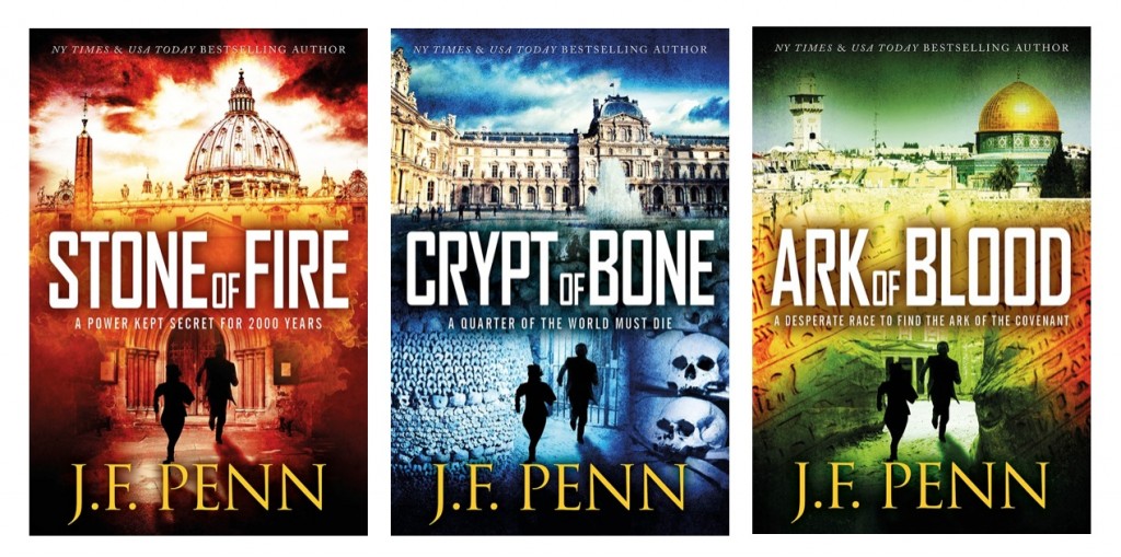
First up, here are the awesome new covers: Stone of Fire (previously Pentecost), Crypt of Bone (previously Prophecy) and Ark of Blood (previously Exodus), designed by the wonderful JD Smith Design.

New ARKANE covers

So, why change my fiction book titles anyway?

Basically, none of us know what the hell we’re doing when we start writing  🙂

Here’s how my first book title journey went.

In November 2009, I joined NaNoWriMo in an attempt to write something fictional. Amusingly, I videoed the process – here’s Day 1, and you can follow the whole journey here. The working title for the book on Day 1 was Morgan – and Morgan Sierra is still the name of my main character and alter-ego, so that hasn’t changed.


Read the full post on The Creative Penn.


The Ultimate Guide to Finding Images for Book Promotion

This post by Dana Lynn Smith originally appeared on her The Savvy Book Marketer site on 2/11/15.

When someone lands on your website, book sales page or social post, you may get only a fraction of a second to capture their attention before they decide to move on. Photos and illustrations (along with strong headlines) are key to drawing the eye and breaking up large blocks of text to make it more inviting.

Carefully selected images can also convey a sense of the message contained in the text, but sometimes bloggers choose beautiful or whimsical images to capture the reader’s attention. (I ran across this gnome image while working on this article and just couldn’t resist!)


Copyright Concerns
Like our writing, the work of photographers and illustrators is protected by copyright. The creators of photos and illustrations can choose to make their work available to others through various types of licenses that govern how and where the images can be used and how they are compensated.

It doesn’t make sense to buy an image for every blog post or social post, but it can be a challenge to find images at no charge. Following are some tips for finding and using images in your book promotion.

Creative Commons Licenses
Many images are available free under a “Creative Commons License”. Although there is no charge for using the image, there may be restrictions on how it’s used and you may be required to give credit to the creator. See the bottom of this page for an explanation of various types of creative commons licenses.

Here are two sources of free creative commons images:


Read the full post on The Savvy Book Marketer.


New Initiative at the Met Makes Thousands of Digital Images Freely Accessible

This article by Chelsea Matiash originally appeared on The Wall Street Journal on 5/30/14. It’s excellent news for indie authors and freelance cover and web designers: thousands of new images licensed under creative commons.

This month, the Metropolitan Museum of Art released for download about 400,000 digital images of works that are in the public domain. The images, which are free to use for non-commercial use without permission or fees, may now be downloaded from the museum’s website. The museum will continue to add images to the collection as they digitize files as part of the initiative Open Access for Scholarly Content (OASC). 

When asked about the impact of the initiative, Sree Sreenivasan, Chief Digital Officer, said the new program would provide increased access and streamline the process of obtaining these images. “In keeping with the Museum’s mission, we hope the new image policy will stimulate new scholarship in a variety of media, provide greater access to our vast collection, and broaden the reach of the Museum to researchers world-wide. By providing open access, museums and scholars will no longer have to request permission to use our public domain images, they can download the images directly from our website.”


Click here to read the full post on The Wall Street Journal.


How I Got An Awesome Cover Design from 99 Designs, and Why I'll Think Twice Before Using it Again

This post by Livia Blackburne originally appeared on her A Brain Scientist’s Take on Writing blog on 12/13/13.

Last week, I mentioned using 99 Designs for Poison Dance’s cover. I love the book cover I ended up with, but I’m hesitant to use the service again. A few people asked me to elaborate.

Here’s a basic rundown of how it works. It’s a contest site, where customers hold contests for artists to compete in.  The winner gets the prize money — everybody else gets valuable life experience. There are three award levels you can choose. The greater though award, the more designers you will have entering. I chose the least expensive package: the bronze package for $299. Here’s my design brief listing my specifications.

After initiating the contest, you go into the first round, where designers submit different cover concepts and you offer feedback in the form of comments and star ratings. As the contest progresses, you start narrowing down the field, until at the end of the first round (about 4 days I think?), you name up to six finalists. Then, you begin a second round as the finalists continuing to refine and rate designs. At the end (3 days?), you choose a winner. If you want to see my top six designs, you can take a look at the poll I created here for people to help me rate the options. Then you choose the winner, make any last tweaks that you need to, and receive your design.

Here are pros of using 99 designs:

1.  Fast

Nowadays, popular cover designers can be booked for months. With 99 designs, you can finalize the design in a little more than a week. (Although you can still get delays at the very end, while your winning artist makes any last changes you request.)


Click here to read the full article on A Brain Scientist’s Take on Writing.


A Treasure Trove Of Book Covers

Over on The Casual Optimist, blogger Dan Wagstaff regularly highlights effective and unusual book cover designs. For anyone looking to design his or her own cover, or looking to bring some ideas to a professional designer, this site’s book cover design posts are required viewing.

Start with 50 Covers For 2013, which also includes links to similar lists for prior years, going back to 2010.

Next, browse the Recent Covers of Note posts.

Finally, check out the 50 Canadian Book Cover Designs post.


How To Make Your Own Free Book Cover In MS Word

This post, by Derek Murphy, originally appeared as a guest post on Joanna Penn‘s The Creative Penn on 10/20/13.

Caring about fantastic book cover design is one of those non-negotiables for all authors.

Derek Murphy of Creativindie Covers is a brilliant designer and has designed a number of my own book covers. But although I personally believe in paying professionals, I’m also aware that some people want to have a go themselves, or need to because of budget restraints. This post is for the avid DIY-ers!

Most indie publishing experts will warn you against making your own book cover, with good reason: the cover design is too crucial an element to self-publishing success to take lightly.

Making your book a bestseller is hard enough without an ugly cover sabotaging your efforts.

However there are many reasons why you may be tempted to give it a shot anyway:

◾ You want to play with cover ideas so you know what you want before hiring a designer

◾ You want more control over your cover design

◾ You’re launching a small project, a short ebook or guide, and you don’t want to invest too much

◾ You’re writing a series and don’t want to pay full price for each cover design

So I’d like to share with you something I’ve been working on for a few months: the secrets of designing a bestselling book cover in Microsoft Word, and then I’ll give you some easy-to-use Word templates so you can get started quickly.

This will be a ‘crash course’ in the minimal skills you need to create a winning cover in MS Word

You’ll learn how to use Word to blend images, add layers and transparency, use font effects and space letters (kerning), strip background, and the general principles of cover design.

These instructions are for MS Word 2010, so they won’t work for everyone, but if you have an older or newer version of Word, the process will be similar. This is a long post, so you should bookmark it. You can also download a PDF version of these instructions and the source files of the cover we’re building so you can follow along; click here to get those. Ready? Let’s begin.


Finding and choosing the right pictures

The quality of your book cover will mostly depend on what pictures or art you use, and how well they fit together, so in this section I’m going to teach you what kind of art works the best, where you can find royalty free images, and where you can get cheap Photoshop work done (if you need it).

The RULES for picking photos:
1) Simple is better
2) Needs to cause immediate emotional reaction
3) Not too busy or too many colors
4) Don’t use a GREAT picture: use the overlooked one
5) Blend and match colors

You can use a color wheel to find complementary colors (opposites/across from each other). Blockbuster movie posters usually use orange and teal (a lot of my book covers do also).

Green and purple can work also.
Unfortunately, Christmas ruined red and green, but red still goes well with black or white.

Too many colors can be distracting, so try to go for one or two main colors (if the whole background is blue, you could use yellow text to stand out…)


What kind of images should you choose?


Click here to read the rest of the post on The Creative Penn.