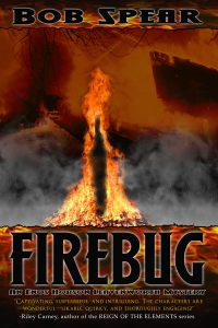
This is what Cliff Fryman, know as @Selorian to his Twitter followers, came up with for an initial design:

I had some suggestions, so he came up with three more versions. We then conducted a marketing survey with our bookstore customers and certain professional artists and designers. Here are covers #2, #3, and #4:

Cover #2 (above)

Cover #3 (above)

Cover #4 (above)
The results of the poll were many liked the first, but were confused by the background in the upper area, which looked like a burning ship to many. Most of the pros said there was too much detail for an on-screen thumbnail image, especially if a square audio book cover was based on the same image. Number four got very few votes as its letters were too dark. Number three got a lot of votes; however, number two won because it was simple, easy to read on screen, and manageable to cut down to a square format.
The flames in the letters in both #2 and #3 were really cool (great work Cliff) and the only difference was some smoke in #3 at the base of the burning stake. The second image cut down to the audio format very handily, as shown below:

Audio Book Cover (above)
The story is based on a true event in Leavenworth’s 1901 history when a young black man accosted a white lady and was arrested as a suspect in similar incidents, including a murder of a girl during the previous year. A lynch mob (white & black) of 5,000+ tore the iron doors off the jail that night, took him to the edge of town and burned him alive at the stake. In modern times, a young man researches his roots and discovers he is a descendant of the burned man. He decides to take vengeance against the descendants of the mob’s ringleaders. The protagonist has to figure all this out and put a stop to it.
Survey’s Hidden Agenda
In addition to helping us make a decision about the ebook cover (ebook is available at http://bit.ly/bUymON), the survey became a wonderful marketing tool to prepare the public for something exciting is coming to our town. We got strong positive reactions to the fact that we would be publishing a mystery series based in our own town which appears very professionally done. Wow, what a powerful side benefit that was!!!
Cliff ’s work as a web designer and illustrator can be seen at http://cliffordfryman.com/ As you can see, I’m very pleased with his work!
This is a cross-posting from Bob Spear‘s Book Trends blog.
