The Getty and Google Unleash Free Art — And Your Creative Potential

This article, by Drue Kataoka, originally appeared on Wired on 12/30/13. Those who do book cover design or who want photos or illustrations for books or marketing purposes will want to pay particular attention: you now have 5,400 more pieces of free, unrestricted artwork and photos to use.

Open sharing has been around forever, accelerating progress in diverse fields. Computing (e.g., Homebrew Computer Club), code (open source), and even academic publishing (“open access,” which goes beyond peer review) are just a few that have multiplied their social impact thanks to this openness. Art may be next, and here, too, technology will play a central role.

Just a couple months ago, The Getty quietly released 5,400 new, high-resolution (800dpi) images from its Getty Research Institute for public use. But here’s the revolutionary part: They did it without fees or restriction. To put this in perspective: Not one of New York’s largest museums — the MoMA, the Whitney, the Guggenheim, the Metropolitan, or the Frick have done that yet.

The big deal here isn’t just that a premiere cultural institution is making so many images available to all, but that it signals a broader, emerging “open content” art movement.

Besides the Getty, the other art institutions leading this open content movement include Los Angeles’ LACMA (which made 20,000 images available for free, albeit in a smaller file size than Getty did), as well as D.C.’s National Gallery of Art, the Dallas Museum of Art, Baltimore’s Walters Art Museum, and the Yale University Art Gallery. And Google. Yes, Google: its Google Art Project (now called the Google Cultural Institute) has been working since 2010 on changing attitudes towards digitization among cultural institutions. The resulting meta-museum now includes high-resolution images of artworks from over 300 institutions available online. Google’s collection is the largest and, not surprisingly, has the most sophisticated and user-friendly UI. However, unlike the Getty, LACMA, or the National Gallery, Google restricts image downloading and sharing.

Open content in art is a huge shift in attitude compared to fairly recently, when art museums viewed the web cautiously, at best.


Read the rest of the article on Wired.


How To Make Your Own Free Book Cover In MS Word

This post, by Derek Murphy, originally appeared as a guest post on Joanna Penn‘s The Creative Penn on 10/20/13.

Caring about fantastic book cover design is one of those non-negotiables for all authors.

Derek Murphy of Creativindie Covers is a brilliant designer and has designed a number of my own book covers. But although I personally believe in paying professionals, I’m also aware that some people want to have a go themselves, or need to because of budget restraints. This post is for the avid DIY-ers!

Most indie publishing experts will warn you against making your own book cover, with good reason: the cover design is too crucial an element to self-publishing success to take lightly.

Making your book a bestseller is hard enough without an ugly cover sabotaging your efforts.

However there are many reasons why you may be tempted to give it a shot anyway:

◾ You want to play with cover ideas so you know what you want before hiring a designer

◾ You want more control over your cover design

◾ You’re launching a small project, a short ebook or guide, and you don’t want to invest too much

◾ You’re writing a series and don’t want to pay full price for each cover design

So I’d like to share with you something I’ve been working on for a few months: the secrets of designing a bestselling book cover in Microsoft Word, and then I’ll give you some easy-to-use Word templates so you can get started quickly.

This will be a ‘crash course’ in the minimal skills you need to create a winning cover in MS Word

You’ll learn how to use Word to blend images, add layers and transparency, use font effects and space letters (kerning), strip background, and the general principles of cover design.

These instructions are for MS Word 2010, so they won’t work for everyone, but if you have an older or newer version of Word, the process will be similar. This is a long post, so you should bookmark it. You can also download a PDF version of these instructions and the source files of the cover we’re building so you can follow along; click here to get those. Ready? Let’s begin.


Finding and choosing the right pictures

The quality of your book cover will mostly depend on what pictures or art you use, and how well they fit together, so in this section I’m going to teach you what kind of art works the best, where you can find royalty free images, and where you can get cheap Photoshop work done (if you need it).

The RULES for picking photos:
1) Simple is better
2) Needs to cause immediate emotional reaction
3) Not too busy or too many colors
4) Don’t use a GREAT picture: use the overlooked one
5) Blend and match colors

You can use a color wheel to find complementary colors (opposites/across from each other). Blockbuster movie posters usually use orange and teal (a lot of my book covers do also).

Green and purple can work also.
Unfortunately, Christmas ruined red and green, but red still goes well with black or white.

Too many colors can be distracting, so try to go for one or two main colors (if the whole background is blue, you could use yellow text to stand out…)


What kind of images should you choose?


Click here to read the rest of the post on The Creative Penn.


BookBinding: Making A Travel Notebook

Increasingly, we work and play in a digital world.

I read, write, publish, market and often interact with friends online, which I absolutely love and value highly. But recently, I’ve been craving some physical creation, so last week I went along to the London Centre for Book Arts and joined one of their awesome workshops.

Because I write in so many Moleskine journals, I decided to make a Travel Notebook, complete with concertina folded envelope in the back. I’d like to eventually make my own paper, print my own work on it and bind limited editions myself – but that’s a while away! (I got the idea from Cory Doctorow’s awesome limited edition work)

Book binding

I made this!

In the (under 1 min) video below, you can see time-lapse footage of the process plus some pics. You can also watch it here on YouTube.

Extra Information:

  • Find out more from London Centre of Book Arts – and apparently there are similar centres in major cities all over the world. Or try searching for ‘book-binding’ locally.
  • I’m wearing a Nike FuelBand on my wrist, which is proving to be a fantastic way to get me motivated to move more in this very sedentary writer’s life we lead!
  • The video was shot with my iPhone using TimeLapse app which takes a photo every 10 seconds and creates a video from it. I just set it up with a GorillaPod adaptable tripod.

Have you tried book-binding, paper-making or any other physical book art? Or would you like to? I’d love to hear about it. Please do leave a comment [in the comments section of the original post].


This is a reprint of a post from Joanna Penn‘s The Creative Penn.


The Point Of The Paperback

This post, by Nichole Bernier, originally appeared on The Millions on 4/2/13.

1.
“Why are they still bothering with paperbacks?” This came from a coffee-shop acquaintance when he heard my book was soon to come out in paperback, nine months after its hardcover release. “Anyone who wants it half price already bought it on ebook, or Amazon.”

Interestingly, his point wasn’t the usual hardcovers-are-dead-long-live-the-hardcover knell. To his mind, what was the use of a second, cheaper paper version anymore, when anyone who wanted it cheaply had already been able to get it in so many different ways?

I would have taken issue with his foregone conclusion about the domination of ebooks over paper, but I didn’t want to spend my babysitting time down that rabbit hole. But he did get me thinking about the role of the paperback relaunch these days, and how publishers go about getting attention for this third version of a novel — fourth, if you count audiobooks.

I did what I usually do when I’m puzzling through something, which is to go back to my journalism-school days and report on it. Judging by the number of writers who asked me to share what I heard, there are a good number of novelists who don’t quite know what to do with their paperbacks, either.

Here’s what I learned, after a month of talking to editors, literary agents, publishers, and other authors: A paperback isn’t just a cheaper version of the book anymore. It’s a makeover. A facelift. And for some, a second shot.

2.
About ebooks. How much are they really cutting into print, both paperbacks and hardcovers? Putting aside the hype and the crystal ball, how do the numbers really look?

The annual Bookstats Report from the Association of American Publishers (AAP), which collects data from 1,977 publishers, is one of the most reliable measures. In the last full report — which came out July 2012 — ebooks outsold hardcovers for the first time, representing $282.3 million in sales (up 28.1%), compared to adult hardcover ($229.6 million, up 2.7%). But not paperback — which, while down 10.5%, still represented $299.8 million in sales. The next report comes out this July, and it remains to be seen whether ebook sales will exceed paper. Monthly stat-shots put out by the AAP since the last annual report show trade paperbacks up, but the group’s spokesperson cautioned against drawing conclusions from interim reports rather than year-end numbers.

Numbers aside, do we need to defend whether the paperback-following-hardcover still has relevance?

Read the rest of the post, which includes a gallery of before and after book covers, on The Millions.

Book Design Quick Tips for Self-Publishers

Recently I was asked to contribute an introduction to print book design for a publication that will be out soon. I decided to address the piece to an author who was thinking about self-publishing, but wondering whether it’s worth doing a print book. Here’s my response:


If you want to sell books at events or give them away to reviewers or to friends and family, you’ll want to use print books. And many people prefer reading print books, even people who own laptops, tablets, and smartphones.

So there’s a big role for print books to play in your publishing plans.

But as a new self-publisher, you may not know how to get your book ready for printing.

Print books haven’t changed much in 500 years and they are far more complex than ebooks when it comes to preparing your book files.

With ebooks, you’re just converting your file from one format into another, then adding some cover art.

But with print books you have to know how they will be printed, who will be printing them, and that specific printer’s requirements. It’s good also if you’ve designed a lot of books before, so you know how the image on your screen will translate into paper and ink.

And if you’re thinking about marketing your print books, they will need to look even better. After all, they’ll be competing with books from big publishers, where all the books are designed and produced by professionals.

Now I’m not going to pretend that I can give you an education in book design and production in this article. But what I can do is give you a big head start on your journey to creating a good-looking, reader-friendly, market-oriented print book.

And point out a few things to avoid so you don’t look like a complete newbie. That would be good, right?

Okay, let’s dive in and start at the beginning.

Newbie Mistakes to Avoid

One thing you probably don’t want to happen is have your book “look” self-published.

Honestly, it doesn’t cost any more to print a book that’s properly put together and intelligently designed than it is to print a book that ignores book publishing conventions and looks like an amateur production.

In fact, I’ve got an idea of exactly what would help you get that book, and I’ll tell you more about that in a minute. No matter what you plan to do with your books, they will be more likely to succeed if they avoid the most common mistakes new self-publishers typically make.

Here are some to watch out for.

  • Getting your pages switched around—remember that all the right-hand pages in your book, starting with page 1, are odd numbers. All the left-hand pages are even numbers.
  • Make sure your blank pages are blank—a blank page doesn’t need a running head, a page number, or “this page intentionally left blank” on is. In printed books, blank pages are just that—blank.
  • No blanks on the right—your book should never have a blank page on a right-hand page.
  • Forgetting the front matter—you want to include at least a title page and a copyright page, and probably a contents page before you start the text of the book.
  • Tiny page margins—trying to save money by printing fewer pages rarely produces a book people actually want to read. Leave enough space on the outside for the reader to hold the book, and on the inside (or “gutter”) so that it doesn’t swallow your text.
  • Not capitalizing properly—titles, subtitles, chapter titles and subheads should all be title case, not sentence case. In other words, all words except short prepositions are capitalized.
  • Avoiding full justification—you don’t really want your book to have “rag right” typesetting, where the right margin is ragged. You want your book to be fully justified, which means that your page of type is a rectangle with all the lines (except the last line in a paragraph) extend from the left margin all the way to the right margin.

If you’re curious about any of these tips, have a look at some of your own books.

You’ll discover that these are rules or conventions of book publishing. Virtually all books produced by professionals will follow these rules and conventions unless the designer has a good reason not to.

By watching out for newbie mistakes, you’ll make your book look a lot better, and your readers will thank you for it.

Picking Fonts for Your Book

One of the big decisions you’ll need to make when it comes time to get your book ready for printing is: What fonts will you use?

What fonts you have available might depend on the software you’ve installed on your PC, and what fonts came along with the program. Or you might have purchased or downloaded fonts from one of the many font sites online.

In any case, here are some guidelines that will help you choose typefaces for your book.

  • Readability—this is the most important quality for your text font, the one that most or all of your book will be set in. Many designers feel that the most reliably readable are fonts based on oldstyle typefaces like Garamond, Bembo, or Caslon. More modern versions include Minion, Adobe Garamond, and Sabon.
  • Contrast—you’ll want a different typeface to use for chapter titles or part titles, and for subheads in nonfiction books. Combining a text typeface with a san serif display face can add drama and subtle allusions to a specific era or style.
  • Legality—fonts are intellectual property, just like your book manuscript. Make sure you have the rights to use the fonts in a book by checking out the licensing agreement, if possible. Most fonts that ship with software are licensed for commercial use, and there are reliable sites where you can download free, commercial use fonts online.
  • Appropriateness—you’ll want a text font for your text, and a display font for your title and perhaps for interior display use. For an academic treatise, you don’t want your chapter titles in Comic Sans, do you? That wouldn’t be appropriate. If you can’t decide, have a look at other, similar books and try to do what they did.

Researching Book Interiors

As many other authors have discovered, there are great guides to how your book should look right nearby. Start taking a critical look at some of the books on your own bookshelf:

  • How do they treat the various elements of book design, like the chapter opening pages, the running heads (or running feet, if they appear at the bottom of the pages), the page numbers?
  • What do you notice about the typefaces these books use to convey the author’s ideas? Is a separate font used for the chapter titles or part titles?
  • How are titles, epigraphs (those are the quotations often found at the beginning of a chapter), and subheads aligned? How are the spaced compared to other elements on the page?
  • What are the margins like, are they symmetrical? Are the outside margins larger than the inside margins? How close does the type come to the edge of the page?
  • If there are illustrations, charts, tables, figures, graphs or other graphics, do they have captions or explanations of some kind? Are they numbered or referenced to the text somehow?

This is one of the fastest ways to educate yourself about how books are put together and what might work for your own book.

Concentrate on books that have been successful in your own genre or category, that will help keep you focused on finding a style that will work for you.

A few hours absorbing these seemingly minute details will give you a grounding in book design as it affects your kind of books. Make notes on the elements you like the best, you’ll use them later on.

You also want to make sure your book is put together properly, that’s really important.

What Will Help

Okay, I promised to tell you about something that would help.

I’ve been working for years on ways for new self-publishers to produce better books. A lot of the over 900 articles on this blog are a testament to that effort.

But guess what? I’ve had a breakthrough, and I’m almost ready to share it with you.

In about a week I’m going to open the door to a new way for DIY authors to create industry-standard, great-looking books. I’ve seen too many of the other kind of books, and it’s time to do something about it.

I’m really excited about this, there’s nothing else like it anywhere. Inexpensive, simple to use, effective.

So stay tuned, I know you wouldn’t want to miss it.


Publetariat Editor’s UPDATE – Joel Friedlander announces: Self-Published Books Get a Major Overhaul with BookDesignTemplates.com


This is a reprint from Joel Friedlander‘s The Book Designer.

Free eBook Formatting & Marketing Guides for Writers

This article, by Jason Boog, originally appeared on GalleyCat.

As self-published authors enter the eBook market, formatting has become more important than ever.

Indie authors don’t have the same support as a major publisher, so we’ve assembled a list linking to formatting guides for all the major eBookstores.

Follow the links below to access these free style guides…

1. Smashwords Style Guide (provides guidance for “major ebook retailers such as the Apple iBookstore, Barnes & Noble, Sony, Kobo and Diesel”)

2. Amazon Kindle Publishing Guidelines (PDF link)

3. Barnes & Noble PubIt! Support & Resources Page

Read the rest of the article, which includes 7 more resources, on GalleyCat. Also be sure to scan the comments section, where many indies are sharing similar resources of their own.

How EBook Readers Shop And The Importance Of Sampling

An author at a conference recently asked me for tips on publishing on the Kindle and then said that he didn’t actually read books on digital devices.

I was kind of gob-smacked because how else are you going to know if there are problems until you start getting 1 star reviews?

When you publish a print book, don’t you buy it immediately to test the process and the quality? So why not do the same for ebooks?

If you’re going to digitally publish, I believe you should own an e-reader, even if just to test how your book looks. They aren’t expensive anymore so there is no excuse.

It’s also important to understand how ebook readers shop, because they are the high-volume readers, the ones who will make up the bulk of your digital sales.

How do ebook readers shop for books?

I read around 95% digitally, on a Kindle Paperwhite and through the Kindle app on my iPhone. I don’t own every device but I certainly test the .mobi format on Kindle and the ePub format on my desktop reader and my iPad and iPhone. I am also a voracious reader, getting through 3-5 books per week, more on holidays. Not having a TV helps!

This is how I shop:

a) I hear about a book on twitter, or I see one at a physical bookstore, or see a review somewhere, or find something I like in the Amazon store Top rankings for categories I like. I surf for fun in the Last 30 Days area.

b) If the book is available as an ebook, I download the sample right away and put it into a collection marked Samples. If the book isn’t available as an ebook, 99% of the time I won’t buy it unless it is an author I am committed to. I have other Collections on my Kindle marked ‘To Read’ which are books I have bought but haven’t started yet, “Reading” for ones I am reading now and “Make Notes On / Review” for those I want to revisit to write notes on or review on Amazon & Goodreads.

c) In between books I am currently reading, I go through my samples. If I make it to the end of the sample, I will usually buy the book because I am hooked. If I don’t, I delete the sample. No sale. I usually give a book 3 clicks of my Kindle before I delete it. Harsh, maybe, but life is too short to read books that don’t call to you.

So your marketing efforts, your book cover, your book description and reviews have helped your book get this far, but it is the sample that leads me to buy. I probably delete 60-75% of my samples so I have a harsh approach, but I don’t think I am an untypical example of a high volume ebook reader (although if you are one also, I’d love to know what you think in the comments!)

Make sure your sample makes the reader want to buy

Your book has to start with something that hooks the reader.

This isn’t new advice – if you want an agent, the first page has to hook them, and readers of print in bookstores may browse the first page, but because there are so many ebooks available, readers are increasingly unforgiving if a book doesn’t fit what they are looking for.

Here’s some tips:

  • Get into the meat as soon as possible. Put all the acknowledgements and extra stuff at the back, not within the sample. I was severely annoyed recently to download an Angela Carter anthology of short stories to find that the entire sample was an essay about her work and the stories didn’t come until later. I looked for a better version.
  • During the editing process, make sure you pay particular attention to what will hook the reader. If non-fiction, what is the problem you’re solving. If fiction, why would the reader read on? What have you caught their attention with? What loops have you opened mentally that they must close?
  • Make sure the formatting is excellent and easy to read throughout. I have deleted samples straight away when they start with coding errors. It denotes a lack of respect for the reader. This is why you need to test and curiously this has happened with more traditionally published books than indie. Seriously, one book was entirely formatted in Bold. Did no-one even check it? (Make sure this doesn’t happen to you!)
  • If non-fiction, DO include the table of contents. If fiction, your chapters don’t really add anything so aren’t so necessary.

What other suggestions do you have for improving samples? How do you shop for ebooks? Please leave your comments [on the original post page].


This is a reprint from Joanna Penn‘s The Creative Penn.

Jezebel Blogger Totally Misses The Point Of Bell Jar Cover Redesign

Publetariat Editor’s Note: strong language

Over on Jezebel, blogger Tracie Egan Morrissey has got her knickers in a twist over the cover design for the 50th Anniversary re-issue of Syliva Plath’s The Bell Jar. Tracie rants:

If Sylvia Plath hadn’t already killed herself, she probably would’ve if she saw the new cover of her only novel The Bell Jar. For a book all about a woman’s clinical depression that’s exacerbated by the suffocating gender stereotypes of which she’s expected to adhere and the limited life choices she has as a woman, it’s pretty fucking stupid to feature a low-rent retro wannabe pinup applying makeup. (Also, it’s ugly and the colors suck.)

Way to completely miss the subtlety of a very cleverly and thoughtfully -designed book cover, Tracie.

As we all know, book covers are supposed to convey something about the content of the book, whether in terms of plot, setting, tone or character. And they must evoke something about one or more of those things using the visual shorthand of imagery—typically, symbolic imagery. Still with me there, Tracie?

Let’s start with the publisher’s description of the book:

When Esther Greenwood wins an internship on a New York fashion magazine in 1953, she is elated, believing she will finally realise her dream to become a writer. But in between the cocktail parties and piles of manuscripts, Esther’s life begins to slide out of control. She finds herself spiralling into depression and eventually a suicide attempt, as she grapples with difficult relationships and a society which refuses to take women’s aspirations seriously.

The Bell Jar, Sylvia Plath’s only novel, was originally published in 1963 under the pseudonym Victoria Lucas. The novel is partially based on Plath’s own life and has become a modern classic. The Bell Jar has been celebrated for its darkly funny and razor sharp portrait of 1950s society and has sold millions of copies worldwide.

Now, looking back at that cover…is this really just a glam shot of a young, attractive woman tarting herself up, signifying nothing more than ‘girls just wanna have fun and look pretty doing it’? I don’t think so.

First, the background color is a dark red. Not only is it an iconic and representative color for the time period of the novel, but taken on its own, completely out of any context, it’s a symbolically negative color that evokes obstacles, conflict and high energy. Red means stop. “Seeing red” means anger. Red is the color used all over the world on warning signs. Red is also the color of blood, and therefore the color most associated with violence. So the background color should clue the viewer in right away on a gut level: this is not a happy book, you have been warned.

Next, look at the model’s pose and facial expression. She is not smiling, and if anything, the corners of her mouth are downturned. She’s touching up her make-up, but she doesn’t look too happy about that. Actually, her reflection in the mirror shows an expression with downturned mouth that looks more like disgust than anything else. And since the woman is looking at herself, wouldn’t this mean she’s disgusted with herself, and/or with this female obligation to be pretty at all times and at all costs?

And how about that compact? Notice how it completely dominates the image? How it’s front and center, shown in its entirety, while our heroine is only partially visible and off to the side? What message does this convey about the industrial beauty complex versus an individual woman? Also notice – the compact’s red color is being cast downward, partially enveloping the woman’s hand and arm. What does that say about this woman’s relationship with beauty standards and rituals? Could it be that she feels she’s being obscured or overshadowed by them?

Finally, how about the font? Notice how the lines are uneven and spidery, that none of the lines of text are level, and how the text very subtly angles increasingly downward with each line.

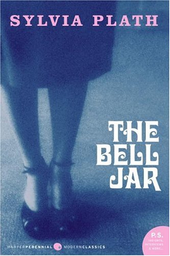
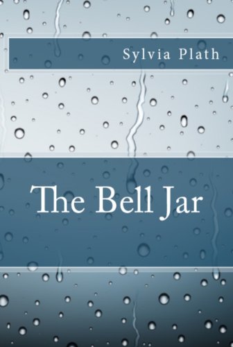
Now consider the pre-existing cover designs for this book, in paperback, hardcover and Kindle formats:

Do any of these covers say anything at all about the content of the book? The first one clues you in that it’s about a woman, but that’s it. The second (the 25th anniversary re-issue cover, BTW) looks more like the cover of a romance novel than a semi-autobiographical account of feminist rage and depression. I guess the rain on the third one symbolizes depression, but that’s all it says. Maybe if you saw all three of them together, you’d get some idea of the content. But as standalones, they don’t hold a birthday candle to the 50th anniversary redesign.

Apparently Tracie would’ve preferred a more literal, hit-you-over-the-head cover, perhaps showing a hot mess of a woman slashing her wrists. But wouldn’t an image like that 1) be a spoiler 2) be a tough sell and 3) overpower the book’s feminist message?


2/7/13 Updated to add: Now THIS is a crime against lit – Anne of Green Gables made over into a blonde farm tart on the cover of a self-pub edition snagged from public domain content http://ht.ly/hvSam

 
This is a reprint from April L. Hamilton’s new site, The Digital Media Mom.

Top 10 Book Cover Design Tips For Self-Publishers

You must first realize that a book’s cover is the equivalent of a product’s packaging. What is on that cover, or packaging, is advertising. You must figure out what needs to be on that cover in order for a buyer to choose your book over the many others that cover the same topic. What needs to be on your book’s cover that will draw in, or attract, a buyer? You must separate yourself from your personal feelings about your book, and think like the buyer would think. What would attract you to a book like yours? Your book cover’s ability to attract buyers will have a direct effect on how well your books sells. So, don’t be afraid to design several covers. And don’t be afraid to hire professional help.

1. The Title Should Be Readable From Six Feet Away

This is a good general rule for most book covers. This is especially important if you ever plan on having your book on the shelf of a bookstore. This will also help with design tip number 3.

2. The Font Should Be Readable And Appropriate

If your cover’s font is too fancy or complicated, it will be too difficult for buyers to read your cover. This will also be important when it comes time to reduce the image of your book cover that will be viewed on the internet. Don’t be afraid to use one font for the main title, and another for the subtitle.

3. The Cover Should Be Recognizable As A Thumbnail Picture

This is extremely important in today’s internet world. Most buyers today will only see your book’s cover as a tiny image before they buy it.

4. The Cover Images Should Reflect The Theme Of The Book

There should be some connection to the overall subject matter and theme of your book.

5. Include Testimonials On The Back Cover

Put several testimonials from big recognizable names on the back of your cover.

6. Include Really Impressive Testimonial On The Front Cover

Put your most impressive testimonial from the most recognizable person that you can get.

7. Include The ISBN, The Price, And The Bookland Bar Code on Back Cover

Amazon, and every bookstore in the world, will only accept your book if it has the appropriate Bookland bar code.

8. Include Bookstore Shelving Category On Back Cover

You put this on your back cover so that the bookstore clerks don’t put your book in the wrong section of the bookstore. It also helps the buyer quickly categorize the book in their own mind.

9. Put Information About The Author On Back Cover

Include any relevant and impressive information about the author, and possibly a picture. This is to help convince the buyer that the author is qualified to write this book.

10. Avoid White Background

Book covers with white backgrounds will simply disappear on the internet, so you should generally avoid white.

This article was written by Joseph C. Kunz, Jr. and originally posted on KunzOnPublishing.com


Getting Started With Microsoft Word Styles for Book Layout

Okay, so you’re sitting at your keyboard pounding away, working on your latest work in progress. You get to the end of a section, hit [Enter] a couple of times and then type the subhead for the next section of text.

You’re an experienced word processor—hey, you’re a writer, right?—so you grab your mouse, select the text of the subhead and start formatting it. Maybe you want your subheads to be Helvetica Bold, 12 point, all caps. (I’m not recommending that, by the way, just using it as an example.)

You quickly select Helvetica from your font menu, change the size, change the alignment from fully justified—which you’re using for the text—to flush left (left-aligned), which is what you’re using for your subheads. Maybe, if you’re nitpicky, you also add a little space above and below the subhead, either by using the [Enter] key or going into the Paragraph formatting palette and setting values in the “Spacing Before/After” boxes.

The Problem with Formatting

That was a lot of work to format a subhead, don’t you think? We walked through about 6 steps to get the formatting right. And you’ll have to repeat these steps every time you come to a subhead in your manuscript.

Some people realize this is a lot of repetitive work and invent shortcuts like copying the last subhead, which copies all the formatting with it, then pasting it where you want the new subhead, and then deleting the old text and replacing it with the new text. That saves time, doesn’t it?

But the fact is that all these methods are bad choices.

Over the course of a long book, can you really be sure you’ve input exactly the same formatting values every time? Did you remember to add that “Space/After” every time? Maybe you should check, since there’s no other way to be certain.

Wait, didn’t you try a couple of subheads in the Verdana font? Did you remember to go back and change those? What about if someone mentions that your 12-point Helvetica bold subheads would look a lot better in 11 point? What are you going to do then?

The Answer to the Formatting Problem

No professional typesetter or designer would face these same problems. Would you like to know why?

It’s because professionals are getting paid for their work. The longer it takes to do a particular task, the less money they will derive from a project with a flat fee. Therefore, they will use the tools built into professional-level software to automate and standardize this process as much as possible. And that’s what you should be thinking about also, if you plan to do your own book interior in Microsoft Word.

Microsoft Word and most other robust word processors now contain a few of the same tools found in high-end layout programs. These are the tools that will make your life easier and your work more efficient. The one you really want to learn right now is Styles.

A style in Word is simply a way to capture all the formatting for a particular piece of text so it can be named, edited, and used for all other similar pieces of text.

For instance, in my example, we could do all that formatting once, then capture it as a Style and call it “Subhead.”

When you get to the next subhead in your manuscript, instead of reaching for the mouse and starting to format it, you just assign the “Subhead” style to it. Bingo, your text is completely formatted in one simple step.

If you learn to do this, the time you spend working on your manuscript will be a lot more enjoyable and contain a lot less of the routine, mind-numbing repetitive work it takes to do these tasks manually.

But using styles has three other crucial benefits:

  1. All the similar pieces of text—like all the subheads—will be formatted exactly the same way, because they are all assigned with the same Style. There is much less margin for error, so you can be sure your book’s formatting is professional and consistent.
  2. You can change the definition of your “Subhead” style—for instance, from 12 point to 11 point—and all the pieces of text with the “Subhead” style will change instantly and uniformly.
  3. Your path to eBook conversion will be greatly simplified, because your eBook files need to have all text assigned to a style, and the styles will enforce consistency on the final eBook files.

One of the great things about using word processing software to prepare our manuscripts is its ability to harness the power of our computers to easily and quickly produce manuscripts and books that are consistent.

And knowing that you don’t have to go back and check hundreds of subheads to make sure they are all perfectly consistent? Well, that’s priceless.

The World Up Until Now

Of course, trying to create a book in Microsoft Word is no easy task. I’m pretty sure it would drive me crazy, but that’s because I’ve never had to do it.

I’ve been spoiled by great tools like InDesign.

But I know there are a lot of authors out there who confront this problem, and I have a message for you.

The world is about to change.

In a couple of weeks I’ll have a solution for your problem that I think you’ll really enjoy. It will take away the pain and frustration of trying to get something that looks like a book out of your word processor.

And in order to use it, you’re going to need to know these styles. So take a few minutes to study your word processor’s styles. It will repay you many times over.


Originally published in a slightly different form at CreateSpace as Start Styling! Word Processing Styles & Why You Need Them


This is a reprint from Joel Friedlander‘s The Book Designer.

How To Publish A Book 101

The rise and rise of self-publishing has meant an influx of writers into the market, and many established authors with back-lists are also joining the fun.

There is a LOT of information out there on how to publish your book, but I still get emails every day asking me how to do it.

I also get emails from people who have paid $20,000+, have been utterly ripped off and are devastated with the results. This happened to me once, although with a lesser financial impact, and I am passionate about making sure authors don’t fall into these traps.

With big name publishers like Penguin/Random House and Simon & Schuster signing up with Author Solutions to further exploit this kind of vanity publishing, you guys need to know there is a better and cheaper way.

I have a whole page on Publishing options here, but I thought a round-up post was called for. There are options below for publishing ebooks and print books, with DIY options and easy, paid services, so there’s something for everyone.

Before you publish

Yes, you need a great book, and I believe you need to go through an editing process, and also get a professional cover design.

If you have existing contracts for your books, and /or have been published in the past, check you have the rights before you publish. If you’re a new author, you have the rights and you can do what you like. You can publish in any or all of the following ways. There are no rules and you can sell globally! [woohoo!]

How to publish an ebook – the DIY option

(1) Format your book in Scrivener to create a .mobi (for Kindle), ePub for Kobo and Smashwords (very soon) or Word, PDF or loads of other formats.

Scrivener is only $45 and the compile function is just one part of the amazing writing software, which many authors (including me) swear by.

* Scrivener for Dummies – interview with Gwen Hernandez

(2) Publish on the ebook stores

For the best royalty rates, you want to go direct to the retailers if you can and the process is easy. There’s plenty of help on each of these sites.

Publish on Kindle at KDP.Amazon.com

Publish on Kobo at Kobo Writing Life. You can also watch/listen to this interview from Mark Lefebvre, Kobo’s Director of Self-Publishing here.

Publish on Barnes & Noble Nook at PubIt (still only for US citizens)

Publish on iBookstore, Nook, or any of the other retailers through Smashwords (free but not so easy to use) or BookBaby (costs but is much more user-friendly). Here’s a useful post on Bookbaby vs Smashwords so you can evaluate the services.

How to publish an ebook – the paid services option

I know that some people don’t want to mess around with ebook files. I used to feel like that too, but seriously, if you’re publishing a lot, then try Scrivener. It will save you loads of money. But if you definitely want help, there are lots of services that can do this, so you should shop around, check reviews and testimonials and ask other authors what they think.

I recommend BookBaby who offer packages to format and distribute your book. I use them myself and I am an affiliate. Here’s a short video chat with Brian Felsen from BookBaby about what they offer authors.

How to publish a print book

Most independent authors make more profit from ebooks, so you should only consider print if you really want it for personal reasons, or if you have a live platform to sell it (e.g. speakers). Then you should consider print-on-demand as the best option as you don’t have to pay upfront printing/storage or shipping costs. Only do a print run if you have the distribution sorted out – too many authors lose money this way (I certainly did!)

If you want a DIY option, and the best financial deal, then LightningSource is probably the best bet. However, you need print ready files for your cover and interior and you have to know what you’re doing.

If you want an easier DIY option, with wizards and extra help, then go with CreateSpace.com, Amazon’s own self-publishing company. They also have an option to make the ebook as well. If you have your own print-ready files, it is free to publish. Here’s a comparison post between Createspace and LightningSource.

If you want to do print properly, soak up everything you can from TheBookDesigner.com – one of the very best blogs for self-publishers.

In terms of premium services, there are more companies offering these every day, some of them at astronomical prices, so please be very careful.

Check out Amazon’s Createspace Premium prices here. Then compare what they offer to anything else you check out, since you know if you go with Createspace that you will be able to sell on Amazon.

If you like the look of a company, then check Preditors and Editors publishing guide for red flags, because a professional online site may still mean a rip-off.

Please note that Author Solutions, which is the service Random/Penguin & Simon & Schuster have chosen is marked: Not recommended. A company that owns or operates vanity imprints AuthorHouse, DellArte, iUniverse, Trafford Publishing, West Bow, and Xlibris. Here’s an article about their dishonest marketing tactics on Writer Beware,

What happens next?

Obviously once the book is available at all online book retailers, it won’t fly off the shelves without some help.

Read this post for starters: Help! My book isn’t selling. 10 questions to answer honestly if you aren’t making enough sales.

Then check out this page for more marketing ideas.

Need more help?

self publish a book

I teamed up with NY Times bestselling author CJ Lyons, who has now sold over 1 million self-published (indie) books, to create a multimedia course that gives you all the detailed help you need to successfully self-publish an ebook and a print book.

It includes behind the scenes videos of creating files using Scrivener and how we publish to all the various stores, as well as top tips for self-publishing, the worst mistakes authors make, how to evaluate print-on-demand companies, secrets of book cover design with Joel Friedlander from TheBookDesigner.com, pricing, piracy, maximizing your sales pages at the book retailers – and much more.

Read more about the course here (it’s just $99)

Recommended Books

If you want to read a book on the topic, then I recommend the following:

Let’s get digital: How to self-publish and why you should – David Gaughran

Self Printed: The Sane Person’s Guide to Self-Publishing – Catherine Ryan Howard

APE: Author, Publisher, Entrepreneur – Guy Kawasaki

Scrivener for Dummies – Gwen Hernandez

Writing a novel with Scrivener – David Hewson

Want to join a community of active self-publishers who help each other out with information and advice? Check out the Alliance of Independent Authors. (I’m an active member and advisor). There’s also a great blog: How to successfully self-publish

Do you have any questions about publishing your book?

Please do leave questions or comments below. This is a community of LOTS of authors, new and experienced, so together we can likely answer everything! I’d also love people to recommend any services they have actually used and thought were good. (No posts from companies though – only authors!)


This is a reprint from Joanna Penn‘s The Creative Penn.

Finding Free Fonts for Your Self-Published Book

You’ve been working on your book, getting it ready for publication.

Maybe you’ve hired a designer to create an eye-catching and sophisticated cover, and that’s usually a good idea. But let’s say you’ve decided to do the interior layout by yourself. After all, there are lots of places you can get information about how to create a good-looking book interior. It doesn’t seem quite as difficult to most people, although that might depend on exactly what kind of book you’re publishing.

First Things First

Inevitably, the first decision you’ll make about laying out your book is what size it will be. Vendors like CreateSpace and Lightning Source offer a great selection of sizes for almost any kind of book you might imagine.

For instance, if I was designing a novel for print on-demand, I’d probably pick either 5.5″ x 8.5″ or 5.25″ x 8″, both standard sizes that are easy to hold and feel good in the hand.

The next decision you’ll have to make is what font to use for the main body text of your book. Now, most people have long lists of fonts on their computers, since many programs come with fonts and they often get installed along with the programs. You might be able to find something in these free fonts that will work for you, but many of these fonts won’t be appropriate for lots of kinds of books.

But you – as a wily internet user – know that there are lots of free fonts available online. Why not just surf over to one of those sites and download a font for your book?

Font Warnings

But not all fonts are created equal, and not every font you find online will work for your book. What should you be aware of when you’re searching for free fonts? Here are some things to watch out for:

  • Fonts that won’t embed—When it comes time to upload your book files, you’ll need to create a PDF with the fonts embedded in the file. The problem is that some of the fonts you download from free font sites simply won’t embed due to technical or legal restrictions. You don’t want to get to the end of your layout process with hundreds of pages that are now perfect just to find out you’re going to have to replace the main font and potentially re-paginate the whole book.

    How can you tell whether the font you just downloaded will work? The only real way to tell is to set a chapter or a few pages with the font and then try to create the a PDF file for just those pages. You can easily find out if the fonts are embedded by opening the file in Adobe Acrobat and checking under the File/Properties on the Fonts tab. Every font in the list needs to show “Embedded” or “Embedded Subset” for your file to work when it gets to your printer.

    If the font didn’t embed, stop now and save yourself the work of redoing your whole book. 

  • Fonts that are illegal—I know, it’s amazing that people post links to property that they don’t actually own, isn’t it? But hey, it’s the internet, and these things happen all the time. If you’re downloading a font from a third-party site, you need to know this. For instance, if you can download a font created by Adobe that you found at “Freddy’s Free Fonts,” you should question whether Freddy bothered to get the rights to distribute it.

    Font foundries often offer free fonts, so you can always go to the foundry’s own website to see what they have available. That way you’ll know the font you have is totally legal, since it came from the manufacturer. You’ll find my recommendation about free font sites at the end of this article.

  • Low-quality fonts—Some fonts are enticing when you see them as a sample on a font site, but they might cause you trouble when you try to use them. What kinds of trouble? You might run into fonts that are:

    • Incomplete. Fonts that were created for a specific function, like a headline in an advertising campaign, are frequently incomplete. They might not have all the glyphs and symbols standard fonts have, or they might lack an italic version to go along with the roman. You don’t want that.
       
    • Badly drawn. A sample might look good, but what’s going to happen when you pour your 100,000-word manuscript file into your layout and have thousands of lines of type? Book pages will show off any eccentricity in the typeface, often with nasty consequences. A cute-looking flourish on a lower case “g” for instance, can make your page look “blotchy” or like it has little “flags” popping up everywhere.
       
    • Misaligned. In a sample, you might not notice that the font doesn’t sit properly on the baseline, but in your book this will show up right away. Same for “set width” errors, where the amount of space each letter takes up has not been calculated properly, causing some letter combinations to have too much or too little space to typeset properly.

A Solution for Free Fonts

Because I’ve been typesetting books for many years, I’m pretty careful about the fonts I use. I have no hesitation about downloading free fonts from foundries like the ones in the resource section at the end of this post, and you should be confident about fonts you acquire this way.

The best site I’ve found for third-party free fonts is fontsquirrel.com. This site aggregates fonts from lots of sources and guarantees the fonts are free for commercial use. Fontsquirrel.com also links to foundries and to myfonts.com, the huge site that sells fonts from most font foundries, in case you decide to buy a font instead.

So go out and explore, now that you know what to look for. There’s a whole world of free, high-quality fonts to discover for your next book project.

Resources

Free Font Collections:
fontsquirrel.com
Font Shop’s Free Fonts
Smashing Magazine’s free fonts
Creative Bloq’s 50 Best Free Fonts for Designers

Foundries with free fonts:
Exljbris Foundry
The League of Movable Type
Chank Fonts
Cape Arcona Type Foundry

Roundup of 30 of the best font foundries

Paid Fonts:
Myfonts.com

If you’ve got a favorite free font resource I’ve missed, let me know in the comments [on the original post] and I’ll update [the]  post.  


This is a reprint from Joel Friedlander‘s The Book Designer.

Popular Searches on Publetariat

Have you noticed: there’s a handy little search box here on Publetariat, right up there at the top of the right-hand column? If you haven’t used it lately, or ever, you might be interested in seeing all the great resources, articles and tips others are most frequently searching for when they come to Publetariat.


Click on any link to view a listing of all articles on the site related to that topic.

Book Promotion

Ebooks

Ebook Pricing

Author Platform

Mistakes Self-Publishers Make

The Writing Life

Book Cover Design

Amazon KDP

Why Go Indie

How to Write

Writer Tools


Enjoy, and feel free to try a few searches of your own!


Book Trailers: Do Authors Get Enough Bang for Their Buck?

This post, by James Moushon, originally appeared on The Self-Publishing Review on 11/26/12.

Because book trailers are becoming a popular online marketing tool, I thought it was time I did a study of what was going on in this phase of book promotion. First, a trailer has to be a part of the total book package. You must keep that in mind as we proceed.

I reviewed 50 trailers, some from the HBS Author’s Spotlight group and some from high-profile authors. That should give us a good cross-section of the development of this relatively new process.


Are they worth the time and money? What did I see and hear that made a good book trailer? It must be noted at this point, the following are my opinions and hopefully some helpful observations.

Plan your Trip

Before you go down this trail, you must plan where you want to end. As you’ll find out, it is more detailed than you would image.

The first major decision to make is how I am going to produce the trailer? Am I going to do it myself or outsource it to a professional? Cost is the primary question in this decision I would guess. As you’ll see in this blog, there are some real good trailers created at a very reasonable cost.

Start of the trailer

Most start with a storyboard in which they create a scene list and match script text alongside each picture or slide. For example, the majority of trailers in my review start with the book cover or a slide with the Title and Author displayed. You may think that is elementary but there were several that didn’t give you that information until well into the video.

How does it sound?

This is important to the effectiveness of the trailer. The music and sound should fit your vision of your book. The sound includes music, voice, singing and special effects. Here are some observations.

Some trailers had great mood music which fit right into the story line. Some had singing in the background. A couple started off with strong music right up front which was a great attention getter.

There was one that was streaming along at a steady pace then out of the blue there was a loud gun shot. That got your attention. Several had cry outs, screams, eerie sounds and even the sound of arrows whizzing through the air.

Two observations: if you are going to use voice over for your slides, use a professional or not at all.


Read the rest of the post on The Self-Publishing Review.

Book Cover Design Resources

This post originally appeared on BookMarketing.net on 7/10/12.

Like it or not, people do judge books by the covers. And poor cover design is one of the areas where self-published authors are most often panned by critics. Self-published authors know this risk, and they know one of the keys to a good cover is a good designer. According to a survey from Taleist, 41% of self-published authors pay for cover design. The survey also shows that authors who get help with editing and design of their books make 34% [more money]—so the investment pays off.


Below is a list of graphic designers who have experience designing book covers. Each has unique strengths and styles, and they range from independent artists to members of larger design groups and publishing organizations. Each shares their advice for authors and a bit about their work in their own words—and they almost unanimously bristled at the “favorite cover” questions. They’re listed alphabetically by first name.

There are many other ways to find a book cover designer. Start with referrals from other writers or by tracking down the designers who created covers you love. The Graphic Artists Guild also has listings of designers to help you find the right fit. You can also find designers familiar with book cover design on LinkedIn, or you can post an ad on Craigslist or Elance. If you’re on a tight budget you can hire students at a local design school.

So how much can you expect to pay? It varies—of course. Some of the factors include who owns the rights to the art, how many sketches and revisions the designer will do, the complexity of the project, whether it’s a paperback or hardcover or ebook, and more. The designers below have a wide range of services from an ebook cover for $395 to original art for $3500. On average (a rough average) an author can expect to pay around $800 to $1000 for a cover by one of these designers. Some are higher, some are lower—but a good price doesn’t necessarily mean they’re a good fit for your book.

Betsy A. Riley

DO find someone who’s familiar with your genre. There are some genres I don’t do—like romance. My style just doesn’t work for that genre.

DON’T forget that you hired the designer because they have some knowledge or skill that you need—give consideration to their advice.

Favorite book cover: Anne McCaffrey’s Dragon Song and The Sisters Brothers by Patrick DeWitt.

Favorite cover you’ve designed: That One Left Shoe, edited by me, and Furred & Feathered Friends: Katrina Castaways by Nancy Clark Townsend.

Website: http://brws.com/http://bluedragonpress.com/


Claudean Wheeler


Read the rest of the post on Bookmarketing.net.