Web Presence Checklist

This post, from Muriel Lede, originally appeared on her site on 7/14/10 and is reprinted here in its entirety with her permission.

 You’ve spent months, perhaps years, writing your book. Did you do so for it to die in obscurity? Why then does its web presence reach no beyond the Lulu Marketplace? Why then doesn’t it even show up upon typing its title on Google? Why then does its Amazon’s sales rank sag below the 4 millionth mark? If that sounds anything like you, keep reading, for I’m about to list all those opportunities to broadcast your title and reach your target audience that you’re missing out on. To the extent that they’re inexpensive, easy, and of course applicable to your book, you have no excuse not to implement them.

Let’s begin with the bleeding obvious—alas so often neglected!—and progress toward the more forgivable omissions:

  • Website

    I mean a real website, with its own domain name and all. These days web space has become inexpensive enough for pretty much any author to afford; I recomment the likes of FatCow and JustHost, that offer unlimited storage and bandwidth, plus a free domain name. But then, even without considering this variable, how many books out there don’t have their own dedicated webpage, paid for or otherwise? How do you expect prospective customers to take you seriously if you don’t even bother to make one?

    Tip: If you pay full price for web hosting, you’re a fool. I suggest you first track down referral links to the provider you’re targeting, which often grant rebates up to 50%. You can do even better than that: start filling out the form until you’ve got an actual quote and reach the payment section, then drop out of it and wait. Chances are, you’ll receive within hours an email offering you an additional discount, no kidding!

    Implementing a webpage is easier than you might think. Anybody can learn basic HTML in a day or two, or ask someone they know to format their contents for them. You don’t know what to say on that webpage? How about putting your title information and book cover, for starters? My own website you can use for inspiration. It’s single-page, with two columns: one for the title information, the other for my sales pitch. A book website doesn’t need to be fancy, nor to have lots of graphics; a minimalistic design might actually work better than a complex website, so forget about Flash and fancy animations that take forever to load. All that matters is that you put your title information, blurb, book cover, and a link to where to buy it. Anything else is unnecessary, and might even be in excess.

  • Blog

    Same as above, except this time it’s totally free, or at least does not incur any additional expense, as you can host it on your own website; I recommend installing WordPress for that purpose, which is both infinitely customizable and very user-friendly. You don’t know what to write on that blog? Let’s start with an announcement for your book, with a link to your website or wherever it can be purchased. Even if you were to abandon your blog after that one post (what I sure hope you won’t do!), that would at the very least help improving your website’s page rank a little. Need more ideas? Think about what makes you or your book interesting, or your target audience’s interests, and write about that. I sure hope your book is interesting, and that you do have a target audience.

    These days, a blog is so pivotal to an author’s marketing strategy that it’s worth spending some time customizing, with links, polls, widgets, and the like; see Facebook, Goodreads, or BookBuzzr for ideas. Don’t hesitate to crowd the sidebar all the way to the bottom. Running out of ideas? Post links to other blogs, and propose that they link back to yours!

  • Author email and signature

    Once again it’s free, while you won’t go very far without one; it’s required to subscribe to pretty much anything. Did you set up your email signature? That’s an opportunity to post a link to your website or blog with every message you send, without additional effort! Keep it subtle and no one will complain. Better still: link to your blog instead of your book’s website, so it doesn’t look like an ad.

  • Announcing on forums and mailing lists

    Did you know that many forums have a section dedicated for authors to spam on? You believe no one reads them? Think again. Besides, even if that held true, it remains another opportunity for increasing your website’s page rank. Arguably the most prominent is AbsoluteWrite’s Announcements, Events, and Self-Promotion forum. You should also search Amazon’s forums for active threads on which to make such an announcement, like these, listed by genre.

    Then there are mailing lists, mostly Yahoo! groups. In my sphere of writing, the largest such list is LoveRomancesCafe, which holds Promo Mondays dedicated for recent releases announcements and excerpts.

    No really, there are places begging to be spammed—so to speak—and readers will thank you for it.

  • Social networking

    I would classify such networks in two categories, for the purpose of this article. One is generic networks, like MySpace, Facebook, and Twitter. The above applies to those: even if you were to treat them as mere parking lots, you’re better off occupying them than leaving them vacant. It’s easy, it’s free, it helps driving traffic to your website, and it makes you look professional.

    Tip: Are you a woman? Make sure to flag yourself as single and looking for a relationship. I guarantee that swarms of men will mysteriously stumble upon your profile.

    More interesting is the second category, those meant for readers, like Goodreads, LibraryThing, and Shelfari; Goodreads in particular, as you’ll see throughout the rest of this article, is a must. It offers widgets you can put onto your blog to list your most recent reads, apps to crosspost these to your other social networking pages, book preview hosting, giveaways, etc. while its features list keeps expanding. To be fair, LibraryThing isn’t far behind, although free accounts have a cap on the number of books you can list.

    Tip: Spend some time thinking of a good-looking user name (or pen name) and designing eye-catching avatars. You want to draw attention to your posts, or they might drown in a sea of comments, especially on high-volume threads. Can’t produce an eye-catching avatar? Use your book cover then!

    In both cases, social networking is all about making friends, so don’t be shy and make requests. You don’t know whom to friend? How about the people you already get along with on blogs and threads? The larger your list of friends, the better, because it makes you look big to strangers discovering your profile.

  • Author pages

    Some websites allow for authors to post biographies and promotional material. One is Amazon’s Author Central, while another is Goodreads’ Author Program. Even if you post only your picture and a short bio, it already helps convincing readers that you’re not a nobody; they might even have the perception that only successful authors have one! Never mind the fact that they’re free and easy to set up. Also, both pages not only provide authors with a blog, then even allow to synchronize with your existing blog! It amounts to automatically cross-posting on both Amazon and Goodreads.

    You can also become a LibraryThing Author, to unlock a significant portion of the above two’s functionalities on their website, only you have to write them a request by email. It has a feature that sets it apart though, for it provides a Hobnob with Authors page where book sollicitation is encouraged.

    Among websites meant specifically for authors, there is AuthorsDen, the largest of its kind and offering the widest array of features—but also the most expensive featurewise. Red Room also grants author pages, although only to those among self-publishers that already made significant achievements; still, a premium membership grants you the right to advertise your book on their website at will, which could nonetheless make it an interesting platform for promotion.

    Tip: Make sure to write down your bio at the third person, as in the following example. Not only does it look more formal, it suggests you’re important enough for someone else to have written it! It’s all about perception.

  • Title information submission

    That one can make a huge difference, although they’re limited to publishers. When a title surfaces on an online store such as Amazon, it’s pretty much naked. There might be a cover, a one-paragraph blurb, and a Buy button, but that’s about it. Did you know you can customize your title’s page on some of those stores? Amazon has a Books Content Update Form, which you can use to upload a formatted description, a table of contents, reviews, etc., and also the Search Inside The Book Program. Regarding the latter: when is last time you purchased a book you couldn’t browse, whether in a brick-and-mortar store or online? It has the potential to boost sales tremendously. Barnes & Noble also provides means for publishers to submit contents, including scans of interior pages. Then there’s also Google Books, so obvious yet so easily forgotten!

    Tip: Did you rate your own title? A five-stars rating, even if it’s propped up by only one vote, draws far more attention than no rating, or even a lower rating from many votes. Unethical? No more than a candidate for office voting for himself on election day. Also, make sure to tag your title according to its contents.

  • Book reviews

    Nothing boosts sales like book reviews, especially favorable ones—but even caustic ones are better than none; the worst review is no review. How about giving it a try? One easily overlooked avenue is Independent Publisher’s Highlighted Titles, which amounts to a seal of approval from a major publication. Then there are blogs that focus on POD titles, such as POD Book Reviews & More, POD People, Self-Publishing Review, The LL Book Review, and The New Podler Review of Books. Feel more ambitious? If your book could pass for a small electronic publisher’s, you could try your luck with more mainstream blogs. You don’t think you’ll be accepted? The worst thing that can happen is that you receive a polite rejection.

    Warning: Avoid paid review services like the plague! Not only are the likes of Kirkus Discoveries a waste of money, most have such a bad reputation that a “review” from them might turn off potential customers at first glance!

    Tip: Should you get glowing reviews, post snippets of these on your website and blog for all to view! If you don’t brag on your own website upon receiving praise from strangers, where and when will you?

    While we’re at it: there’s nothing to stop you from commenting on any of the above blogs and beyond. If anything, that contributes to spreading your name even further and building your reputation. Plus, many blogs allow for a link to your website with every post you make! Once again this helps improving your website’s page rank, to the point that link spammers track down WordPress blogs and mechanically comment on them for that single purpose. Of course you’re not spamming, as long as you’re contributing to the conversation.

  • Contributed articles

    There are several blogs and websites out there to which you can contribute your own articles. There is no better way to build your reputation than to provide authoritative advice on a popular blog. As a bonus, this constitutes yet another opportunity to post a link to your website. You think this is link spamming in disguise? You’re totally right, and this is precisely the attitude you should be having, never to miss an opportunity to plaster your name and a link to your website wherever you can. As long as you post something pertinent and useful along with it, not only will you get away with it, readers will even thank you for it! Especially if it saves them money and weeks of research.

    Registered Self-Publishing Review and Publetariat users can post blog entries, which may end up promoted to the main page. Some other blogs, such as POD, Self Publishing and Independent Publishing, also are open to article submissions.

    The following articles detail how to post at ezinearticles.com:


Then there is the optional, but still worth considering:

  • Contests:

    These are long shots, but could give your book tremendous visibility should it be selected even among the finalists. Two reputable contests immediately come to mind: one is the Independent Publisher Book Awards, better known as IPPY, the other is the Amazon Breakthrough Novel Award or ABNA, the latter which I advise to enter as early as possible since each category allows only up to 5000 entries. Yet another would be the Writer’s Digest International Self-Published Book Awards.

    Warning: Star clear of “vanity” contests, like those charging exorbitant entry fees or those that guarantee an award to all entrants. In doubt, consult Writer Beware.

  • Book trailers:

    It’s just as possible for a self-publisher with next to zero budget to produce a decent book trailer than it is for LucasFilm to produce a 112 million dollars lemon. Money has little to do with it, it’s more a matter of skill and creativity. And then, there are two undeniable advantages to making a book trailer: you can post it on Youtube, which millions browse while eating breakfast; while it can ironically make your book look like it’s a big budget title, to the extent that it’s good enough and that viewers believe only big-budget titles have one. Smoke and mirrors? In this business, perception is everything.

    A good starting point: 43 Book Trailer Sites to Inspire, Instruct, and Share. You will probably need iStockphoto, both the best and the cheapest among stock pictures websites; indeed, most others either are outrageously expensive or set unacceptable restrictions on how to use their contents. Once you’re done, you can upload it to your Facebook, Myspace, and Goodreads profiles, to AuthorsDen (requires Gold membership) and Redroom, to Amazon (through Author Central), and also to book trailer websites such as BlazingTrailers, PreviewTheBook, LiveWriters, TrailerSpy, and Metacafe, in addition to regular video sites such as Youtube, Yahoo! Video, Vimeo, and Revver, and also to blogs like Rate My Book Video!. Not only will most of the aforementioned link back to your website, thus improving its—well, you get the picture—but some even enrolled into Amazon Associates and will help you sell your book through their own website! You can also promote it on Goodreads’ Book Trailers ™ & Author Web Sites group.

  • Paid advertisement:

    This one is controversial. You will be told that it’s not worth it, especially for a self-publisher. But then did you sit down and actually calculate how much an ad would cost you versus how much you expect to earn in increased sales? You might decide against it. You might not be able to afford it. But you have no excuse for not considering it. Publishing is a business, and businesses advertize. The successful ones, anyway.

    Among affordable options, there are Google AdWords, Yahoo! Sponsored Search, Facebook Advertising, MySpace MyAds and Goodreads self-serve advertising. All these allow for arbitrarily low budgets, so you can try them simultaneously and see which one works best. Websites like Bookslut, Bookgasm, and Publetariat offer banner advertising that mere mortals can afford, so you might want to try that too.

    Tip: There are plenty of coupons for Adwords and the like floating around, so you can try them with a rebate! See whether your website provider offers any; if so, you’d be a fool not to use them. At the time of this writing, Google even offers a $75 free trial to residents of the United States and Canada!

    Initially, your target should be to break even, not to make a profit; what you’re really after is to get ratings and reviews while improving your sales rank. Little drives potential customers away more than a title with no prior activity, which also keeps it buried at the bottom of search results. This is a vicious circle you must break as soon as possible. Given what is at stake, this is well worth spending a few hundred dollars, especially if you have already poured that much into your project.

    Speaking of reviews and such, the most effective way to obtain them is to organize giveaways. Of course many blogs and mailing lists might be happy to award your copies to their readers, although a more reliable way would be to leave that to the likes of Goodreads and LibraryThing. BookBuzzr Games also provides a program to give away copies as prizes.

  • Merchandise:

    This is an opportunity to expand your visibility both online and offline. Do you have a gorgeous book cover, logo, or palette of graphics? How about plastering these onto T-shirts and coffee mugs? CafePress allows you to do just that. Not only is it free and easy, it even opens a secondary revenue stream!

The possibilities are endless. There always remain inexpensive and efficient tribunes from which to market your book, so keep digging. Are you sure you didn’t miss a blog, forum, mailing list, reader or author organization, fan website, announcement thread, list of featured books, link directory, link reciprocity program, etc.? How about those that keep popping up all the time? How about those regarding connex topics? No search can be exhaustive, let alone a list, so never stop looking for more avenues, and use your imagination to create some where most people would see none.

Free E-Books

There’s a lot more to my site than that, once you drop down past the "lemme edit your writing" crap, but I think you’re most interested in the freebies.


http://www.michaeledits.com


Storyist Software Offers Easy ePub to Self-Publishers

About a month ago I came across the software Storyist for the first time. I was taken by Storyist’s idiosyncratic interface and knew right away that it had to be the work of a single individual. You don’t often get quirky hybrid software from a committee.

The man behind Storyist is Steve Shepard, a high-tech entrepreneur and writer who created it to solve his own dissatisfaction with the software tools for writers that were available.

 
It’s really an immersive environment, and if you find the Storyist interface to your liking, it will probably become addictive, because no other program I know provides this type of interaction with your writing project.
 
The complete Storyist set of modules or features includes:
  • Word processor
  • Page layout
  • Outliner
  • Storyboard
  • Manuscript and Screenplay formatting
  • Style sheets, style editor, project wide searching, links, etc.
storyist epub files self-publishing

Click to see the Storyist interface full size

Storyist isn’t only a word processor, it has the ability to track your plot, your characters, even the settings in your book or screenplay. Storyist handles screenplay formatting and straight narrative formatting, producing what it calls “submission-ready” files for output.

However, none of that, even though it’s interesting, is what made me stop and take a second look.
 

Storyist: ePub Conversion for the Masses?
What really attracted me to Storyist was the announcement a few weeks ago that they had added support for ePub conversion right inside the program. As ePub becomes more prevalent, I think we’ll see more and more consumer level tools with the ability to “Save as” or export files direct to ePub without the need for a separate program, or for an outside contractor.
 
ePub conversions are notoriously uneven. The format also has critical limitations in its ability to deal with graphics, tables, charts and other non-text elements.
 
But after watching Shepherd’s video demo of how to create an ePub, I just had to try it. It’s a terrific demo and I really sat up and paid attention when I saw how easy it was.
 
I’m not going to repeat the steps that Steve Sheperd outlines in the video, I don’t think I could improve on it. But in brief, here’s what I did, and what you can do too.
You’ll have to be the judge of whether it makes sense for you to try to do your own ePub conversions. Depending on how complex your books are, and how good you are at techie stuff, learning how to do this properly is going to take time and energy. Should you work on your writing or marketing instead? Maybe. Having said that, the promise of an ePub export that’s as easy as creating a PDF is pretty enticing. That’s the origin of this story.
Step by Step to the iBookstore (sort of)
I grabbed the first part of a manuscript I’m editing for publication. It’s a lecture from the 1980s and it seemed perfect for ePub because it’s got virtually no formatting, just paragraphs. I might have spruced it up a bit, but I was more interested in whether this super easy ePub conversion could really be as simple as it looked on the demo.
 
I wanted a Report Cover look to go with the text, since the document was only about 10,000 words, and I wanted to see how the iBooks software would render this style of cover instead of a book cover. I created one in Photoshop and saved it as a JPG file. Here’s what happened next:
  1. I dropped the text file into Storyist and applied some basic formatting with the Styles dialog. It was easy to edit these styles for a better appearance. Every paragraph has to be styled for best results, so the easiest way is to assign everything the “Body Text” format, then just change the headings as needed.
     
  2. Then I dropped the cover file into Storyist.
     
  3. After choosing “File/Export” from the menu, I was presented with a series of dialogs which are explained briefly in the demo video and more fully in the Storyist documentation, but there was nothing difficult. You choose your files, make sure they’re in the right order, complete publication information, and add metadata to your file.
    I was struck with the complete list of choices you have for assigning metadata. (Checking the documentation, it turns out the metadata fields correspond to the fields specified by the Dublin Core Metadata initiative. Controlling this metadata is critical to self-publishers in the digital space, and bears more discussion than I have room for here.)


    storyist epub metadata self-publishing

    Click to see the metadata record filled in
     

  4. Storyist wrote the book files in ePub format to my drive.
     
  5. I dropped the ePub file into iTunes and plugged in my iPad. iTunes, recognizing the ePub format as that used by iBookstore, automatically loaded my brand new eBook into the iBooks Library, ready for reading, as you can see in the screenshot at the top of this article.
iTunes metadata self-publishing

Click to see the metadata in iTunes

Not including the time it took me to work out the Storyist interface, stumble over technical obstacles I simply didn’t understand, email back and forth with Steve Shepard to get help for my newbie questions, create the cover file in Photoshop, this whole process was incredibly fast, well under an hour.

Of course, with all those things, I’ve been working on this about three weeks.

Self-Publishing In the Age of Instant Gratification
Granted, in my process my “book” only ended up in my iBooks library. But this is the file format you need to submit your book to the iBookstore, or to an aggregator for listing on your behalf. It’s the same file type used by Sony Reader, B&N Nook, and other eBook readers. I opened the file without a problem in Calibre as well.
 
What I was struck by at the end of this experiment was the speed with which you can put a book together and publish it in eBook form. I could sit at my Mac right now and start typing, and when I finished I could have the resulting book, along with a graphic cover, online and potentially available within an hour.
 
I was amazed at the speed, flexibility and ability to radically reduce the financial risk of publishing you gain from using digital printing and print on demand distribution. But this was a different order of magnitude. This was the closest I had come to feeling like I was Being the Media, publishing a product—not a blog post or a story—so directly and immediately.
 
I’d like to say what the implications of this are, but I’m curious about you. What do you think of this ability to quickly and easily “publish” right from your desktop? Will it affect you?
 
Ed. note: Cheryl Anne Gardner points out in the comments that I failed to mention whether the ePub files that I created in Storyist were epubcheck compliant. I created two ePub files when I was preparing this article, and ran them both through the epubcheck software. One passed inspection and one did not. Walt Shiel tells me that this error refers to duplicate entries in one of the ePub files. I have no idea how Storyist would handle more complex formatting, or what percentage of files it produces are epubcheck compliant. To be accepted into the iBookstore, your files will have to pass this same compliance test. I would encourage anyone who wants to make use of this tool for ePub formatting to download the free sample and try it and, if you have problems see whether they can be resolved by Storyist support.
 
Ed. note number 2: I received a note from Steve Shepard about what likely caused the error on my ePub file that wouldn’t verify. It was a simple fix and turned out to be something I simply forgot when making the file. After correcting it—putting the cover in the proper order in the file list—the resulting ePub passed epubcheck 1.0.5 with no errors. Your mileage may vary.


This is a reprint from Joel Friedlander’s The Book Designer.

6 Common Publishing and Marketing Mistakes

In [this] guest post [which originally appeared on The Savvy Book Marketer], Mark Coker, founder of ebook publisher Smashwords, shares some of the most common mistakes that he sees authors make in publishing and marketing.

The most common ebook publishing mistakes that I see are:

1.  Sloppy editing:  Although Smashwords makes it fast, easy and free to publish an ebook, we don’t make it easy to write a great book.  Many indie authors rush their books to market before the book has been properly edited or proofread.  I can’t underscore the importance of good editing.  Every book benefits from the unforgiving eye of an independent editor and proofreader. 

2.  Sloppy book covers:  Some authors, after investing a lifetime in writing their book, invest under five minutes to create a quality book cover. If a picture tells a thousand words, an ugly book cover image tells the book buyer, “don’t click here.” Good ebook cover design services can be had for under $40, so why sell yourself short? 

3.  Failure to understand that ebooks are formatted differently:  Some authors, especially those with years of professional publishing experience, have a difficultly making the transition from print design to ebook design. With ebooks, simpler formatting and layout actually improves the value of your book to the reader. If authors obsess over making their ebook look like an exact facsimile of their print book, they invariably cause themselves great frustration, and ultimately release their book in fewer formats or worse, they damage the reading experience.

Common book marketing mistakes include:

1.  Late to market:  If an author waits until their book is published to start their marketing, they’re too late. Authors should build their marketing platforms early, before they’ve even put pen to paper, or finger to keyboard. Marketing should be a career-long endeavor.

2.  Failure to make marketing a daily priority:  Every author needs to realize they are competing against millions of other authors for the limited eyeshare of readers. Authors should spend a minimum of one hour a day to make themselves and their work more visible to readers.  Online social networking tools such as Twitter, Facebook, LinkedIn and message board forums not only make this easy, but rewarding as well. At the end of every day, authors should ask themselves, “what did I do today to build my platform, and what will I do tomorrow?”

3.  Spamming social network followers:  Bookselling has always been about word of mouth, and nothing catalyzes an author’s marketing campaigns like a good social networking presence. If you can cultivate hundreds or thousands of followers on Facebook or LinkedIn or Twitter, and you can motivate them to care passionately about your success, then you have a powerful marketing tool at your disposal. But don’t spam your followers with a constant barrage of “buy my book” messages because they will tune you out.  Instead, enter into a two-way relationship with them.  Contribute value to your online communities. Participate. Pay it forward. The value of your network is not how many books they will buy, but how, as your advocates, they will spark the word of mouth necessary for true book success.

I encourage all authors to download Mark’s free Smashwords Book Marketing Guide for some terrific book promotion tips. For information about publishing ebooks through Smashwords, see  How to Publish at Smashwords. You can follow @MarkCoker on Twitter. And don’t miss my interview with Mark: How to Make Your Books Available in Multiple Ebook Formats.


This is a cross-posting from Dana Lynn Smith‘s The Savvy Book Marketer.

Comparing Ebook and Print Book Covers

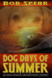
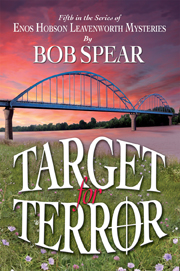
Clifford Freyman and Angela Farley were the two illustrators I was fortunate to have designing my mystery series covers. Cliff, known as @Selorian on Twitter, is a web designer and author who did my ebooks/audio covers. Angela, a freelance designer in Kansas City, has always done my print book covers. I thought you might find their work comparisons interesting.

Both are superbly creative but approach their media differently. Cliff”s, on the right,  have to standout on the screen and Angie’s, on the left,  have to catch a customer’s eyes on a book shelf.


This is a cross-posting from Bob Spear‘s Book Trends blog.

Making a Comic Book on Your Computer

This post, from Luke T. Bergeron, originally appeared on mispeled.net on 6/14/10.

I’ve posted about the comic I’m making a few times before. I don’t really know what I’m going to do with it once I’m done with it, but it’s so much fun making it that I plan to worry about that later. I know I’ll probably have a print version and a digital version available in some form, but right now I’m focused on finishing it.

Making the comic has been a multi-step process I’ve learned through trial and error (by wasting lots of digital PDF ink – luckily it’s free). I don’t know all the ropes – I only know what works for me – but what works for me might work for you, too. So I thought I’d take a few minutes and explain my process:

The Script – Microsoft Word

comic book script picture

Tune Comic Script page 20

The first thing I did, before anything else, was write the comic book. In my case, I adapted a script I’d written for a video game, since it was largely visual anyway, but I imagine that starting from scratch would be similar.

I wrote in a Word document, with each page in Word devoted to a page in the comic book. At the top of each page was a line telling me the page number and how many panels the page needed. Here is the actual top line from page 20 of my script:

20 Page – 6 Panels – 4 same sizes, 1 long bottom wide panel, one small shot at the bottom

I did it this way to make it easy to lay out later – because of my layout process, knowing how many panels I had on each page (before diving into the content) was easiest for me – it made the layout faster.


Read the rest of the post from Luke T. Bergeron on mispeled.net.

Top 8 Cover Design Tips For Self-Publishers

We’ve all seen them. The train wrecks. The art class projects. The cringe-inducing artwork. It’s the world of do-it-yourself book cover design.

 
Somewhere between the quirky “cover design generators” on author-service company websites, and the All-American view that everyone should get a ribbon because, after all, they participated, the cover design is suffering at the hands of self-publishers.
 
And no, I’m not saying that self-published books aren’t getting better—there are a lot of great-looking indie books out there. But I am saying that you don’t have to go far to find the ones that went wrong.
 
Book cover design, at its height, is an amazing commercial art. The best book designers continue to amaze and surprise us with their graphic design prowess.
 
But anyone who can write and publish a book ought to be able to avoid at least the worst mistakes in cover design.

So, here without further ado, are my

 
Top 8 Cover Design Tips for Self-Publishers
  1. Establish a principal focus for the cover—Nothing is more important. Your book is about something, and the cover ought to reflect that one idea clearly.
    One element that takes control, that commands the overwhelming majority of attention, of space, of emphasis on the cover. Don’t fall into the trap of loading up your cover with too many elements, 3 or 4 photos, illustrations, maps, “floating” ticket stubs.
    You could think of your book cover like a billboard, trying to catch the attention of browsers as they speed by. Billboards usually have 6 words or less. You have to “get it” at 60 miles per hour, in 3 to 5 seconds.
    A book cover ought to do the same thing. At a glance your prospect ought to know;
    • the genre of your book,
    • the general subject matter or focus, and
    • some idea of the tone or “ambiance” of the book.
    Is it a thriller? A software manual? A memoir of your time in Fiji? Your ideas on reform of the monetary system? Each of these books needs a cover that tells at a glance what the book is about.


  2. Make everything count—If you are going to introduce a graphic element, make sure it helps you communicate with the reader.
     
  3. Use the background—Avoid white backgrounds, which will disappear on retailer’s white screens. Use a color, a texture, or a background illustration instead.
     
  4. Make your title large—Reduce your cover design on screen to the size of a thumbnail on Amazon and see if you can read it. Can you make out what it’s about? If not, simplify.
     
  5. Use a font that’s easy to read—See above. There’s no sense using a font that’s unreadable when it’s radically reduced. Particularly watch out for script typefaces, the kind that look lacy and elegant at full size. They often disappear when small.
     
  6. Find images that clarify—Try not to be too literal. Look for something that expresses the mood, historical period, or overall tone of the book; provide a context.
     
  7. Stay with a few colors—If you don’t feel comfortable picking colors, look at some of the color palettes available online to get a selection of colors that will work well together.
     
  8. Look at lots of great book covers—You may not be able to mimic all their techniques, but the best book covers are tremendous sources of inspiration and fresh ideas.
Resources
  • You can always send your book over to the Self-Published Book Design group at Self-Publishing Review. Get a Design Review of your book, inside and out.
     
  • There is lots of stock photography online to explore, and ways to find images you can use for free
     
  • Sites with color palettes can be helpful and just plain fun. Make up your own color palettes too.
Takeaway: Taking a little care with a book cover you’re designing yourself can produce big results. Look at lots of book covers for inspiration.


This is a cross-posting from Joel Friedlander’s The Book Designer.

Create Printed Marketing Materials to Promote Your Book

Many authors and indie publishers rely on online book marketing tools like websites, blogs, email and social media to promote their books. But you may also need some printed materials such as bookmarks, business cards, postcards, sell sheets, and posters.

Designing and printing marketing materials can be costly, so make sure you have a clear need and purpose for these items in your book marketing plan before you purchase them.

Bookmarks are great for distributing at book fairs and events and to bookstores that stock your book. Posters may also be useful for events and bookstores. Libraries like to receive posters and bookmarks for children’s books. If you do a lot of speaking or other events where you’re selling books, consider having a retractable banner made.

If you meet people at speaking engagements, networking events, or other venues, you’ll need business cards. Two-sided business cards cost a little more, but you can showcase your book on one side and your contact information on the other. If you need business cards only occasionally, you might design bookmarks with your contact information so they can double as business cards.


Postcards are especially effective for announcing the publication of a new book, but make sure you have a good mailing list before ordering them. You can send postcards to friends, family, and business contacts, and you may also be able to rent mailing lists for your specific target market or exchange lists with a colleague.

Postage is expensive, so if your mailing is more than 200 pieces you may benefit from using bulk mail rates. Check with a local mailhouse for pricing. You can also save by printing your postcard at 4×6 inches and mailing it at the 28-cent postcard rate instead of first class.

Most correspondence is done by email these days, so it’s likely that you won’t need any printed letterhead. If you ship books to customers, you may want to buy mailing labels or return address labels.

A sell sheet is a flyer that’s used to promote books to libraries and bookstores and can also be included in press kits or distributed online in PDF format. It’s important to include the ISBN and other vital statistics and a list of wholesalers where the book is available. Here’s an example of a sell sheet.

If you’re a nonfiction author with other products and services to sell, you might benefit from using promotional items like custom printed pens or sticky notes.

Your book cover designer may be able to design coordinating marketing materials for you. Cover designer Anton Khodakovsky has several samples of book marketing items on his website, including a poster, sell sheet, postcard, business card, and bookmark, all designed to coordinate with the cover of George Beck’s thriller, Trounce.

Many subsidy publishing companies offer book marketing materials such as postcards and business cards. Before purchasing these products, have a plan for using them and find out how much input you will have in the copy and design. You can probably get these pieces printed at a lower cost elsewhere, but be sure to factor in the cost of graphic design.

Here are some more tips for producing book marketing materials to promote your book:

•    Make sure there’s a sales message on your printed materials, not just a book cover and title, and always include your website address.

•    Brand your printed materials to coordinate with your book cover, website, and other marketing items.

•    Items like bookmarks and postcards are much cheaper per unit when ordered in larger quantity. Think about all the ways you can use these items and consider ordering in quantity.

•    Compare prices with local printers as well as online printers such as PrintingForLess.com, but don’t forget to factor in shipping costs. Local printers may be more economical for smaller quantities and they may also have graphic artists available to prepare artwork the artwork.

Printed materials can be very effective in promoting your book, but you’ll get the most benefit from your investment when use them strategically.


This is a cross-posting from Dana Lynn Smith‘s The Savvy Book Marketer.

Establishing A Brand

I have been working my way through the Platform/Promo Lessons in Publetariat’s Vault University curriculum  by April Hamilton and Zoe Winters (I was fortunate enough to win access to Vault University as a winner of Publetariat’s First Anniversary Contest.) While I don’t plan on revealing any detail on the excellent material presented in this curriculum (if you are interested, the fee is just $5 a month for monthly lessons, and I would highly recommend signing up and/or purchasing a copy of April Hamilton’s Indie Author Guide), I am using the subject headings of the sixteen “lessons” in the curriculum to evaluate my own attempts at promotion of my historical mystery, Maids of Misfortune: A Victorian San Francisco Mystery. As someone who has been teaching (and therefore evaluating students) for 35 years I figure it will be a humbling experience to see how well I have learned my lessons!

 
Over five years ago, in one of my last attempts to get an earlier version of my book published through traditional means, I went to a local writers convention where numerous speakers talked about the need to establish a brand. At the time, I remember being discouraged by the news that marketing departments of traditional publishers seemed to have achieved the ascendency in publishing, and that only those authors who could demonstrate a sure-fire market for their “brand” had a hope of getting published.  Nevertheless, I had to admit as a reader I responded to the visual cues book covers and posters offered me when I browsed bookstores, looking for the latest work by a favorite author, or looking for new authors to try out. If this is what was meant by a “brand,” well, that I could understand!
 
Consequently, a year ago as I began to rewrite my manuscript, I also began to think about how I would establish those visual clues for my future readership. The most obvious information I needed to convey about my book was that it was an historical mystery set in the Victorian era. The book was also to be the first in a series of mysteries with the same protagonists, set in San Francisco, emphasizing different female occupations of the era. Ultimately the choices I would make for the title of the book, the name I used as author, and the cover of the book would all be part of providing the visual clues that would “establish my brand.”
 
Title:
I had already decided on Maids of Misfortune as my primary title, (it sounded dramatic, domestic servants play key roles in the mystery, and no other books by that title seemed to exist), but now I had to decide on the subtitle, which I would carry through the subsequent books in the series. I had done enough reading about the increasingly important role the internet plays in modern book marketing to know the title of the book could play a crucial role in determining whether or not a potential reader could find my book. Using “late Nineteenth Century” sounded too academic, and I eliminated the two most obvious alternative terms used for the late Victorian period, “Gaslight” and “Gilded Age” because a google search revealed too many other authors with multiple books had already expropriated those tag lines. So I decided simply to make my subtitle as descriptive as possible, referring to both the time period and the setting, and the sub-title A Victorian San Francisco Mystery has certainly done the trick.
 
If you do a search in Amazon books and use the term “historical mystery,” over 7000 titles pop up, but when you put in “victorian mystery,” the list narrows to 323. In addition, after being out for 6 months, Maids Of Misfortune is second on that list. If you put in another term that is popular for series with female protagonists “women sleuths” you get over 11,000 titles, but when you put in the term “San Francisco mystery” you get 589 titles (who knew there were so many mysteries set in San Francisco!) and I am pleased to say that currently Maids of Misfortune comes up first on that list. My intention is to use this subtitle on the rest of the books in the series, which should cement it as part of my “brand.”
 
Author’s Name:
My birth certificate says Mary Louisa Locke, but growing up I was always called Mary Lou, a hokey 1950s sort of name (for those of you out there of the baby boom generation-all I need to say is Ricky Nelson).  I never wanted to be called Mary (my grandmother’s and oldest Aunt’s names), and Mary Louisa sounded so old-fashioned-so Mary Lou it stayed. When I married in 1972 (not coincidentally the year Ms Magazine started) I decided to keep my own name, so I remained Mary Lou Locke. When I got my doctorate and started teaching, I shifted to Dr. Locke as the way I introduced myself because it was easier than correcting people when they called me either Mrs. or Miss, since nobody seemed willing to use Ms. Besides, as part of a small number of women with doctorates in history, I was proud of the honorific. Meanwhile, my husband and close friends got in the habit of calling me Lou.


So, what variation of my name should I use as an author? I find it amusing to realize I never spent any time as a girl wondering what my “married name” would be, but I have spent a good deal of time over the years wondering what my pen name would be. In part this was because when I started writing a novel, I was at the beginning of my academic career, had written several articles as Dr. Mary Lou Locke, and thought that it might be useful to keep my fiction and non-fiction personas separate. But fast forward thirty some years, and I was now at the end of my academic and teaching career, and this motivation was gone. I tried different iterations of my name (including adding my husband’s last name in the mix) but the one that sounded the most Victorian to me was M. Louisa Locke. In fact when I said it out loud, it always reminded me of the name “Louisa May Alcott,” and what could sound more Victorian to potential readers than that?  So M. Louisa Locke became my pen name, and not a few people have mentioned how very “nineteenth century” it sounds.
 
I also decided to use that name as my domain name for the website I established, for all social networks, and my email address. It was a name that didn’t show up when I first searched for it, so I knew that by using it consistently it would also start establishing a high web presence. Now when you google M. Louisa Locke it is the only link you find in the first page of listings.
 
Cover:
There are numerous articles on why the cover design is one of your most important marketing tools, and I decided that this was one area of self-publishing my book that I did not want to do myself. However, one of the benefits of publishing my own book was that I could have full control over the final design of the book cover. After doing some comparative shopping on the web, looking at book covers of historical mysteries, and asking everyone if they knew any professional designers, I came up with someone who met my needs perfectly. I wanted someone who was not only a professional designer, but someone who might actually read and enjoy the kind of light, romantic mystery I had written.
 
Michelle Huffaker, who designed the cover of Maids of Misfortune, was local, so I could actually talk face to face with her and lend her books I had accumulated on Victorian fashion, interior design, architecture; she was both an artist and a professional web-designer, so she knew how to present for the web and prepare images for electronic books and print on demand; and she was a reader of light fiction (and didn’t begin her design until she had read the completed manuscript.)
 
I knew what elements I wanted on the cover. I wanted the background of the cover to represent Victorian wallpaper, which was characterized by linear patterns and I wanted a deep red, which is a signature color of the Victorian period. In the center of the front cover I wanted an illustration of a mistress and servant I had found in a late Victorian magazine.
Michelle Huffaker gave me that and more (and at a very reasonable price).


If you look closely at the cover you will see that she manipulated the classic Victorian pattern she found for the cover so that the edges were darker than the center, and, as a result, it really looks like the kind of fading you would find in old wallpaper. She researched Victorian fonts, finding fonts that not only stand out, even in small thumbnails pictures, but also evoke the nineteenth century. And she placed the black and white illustration into an ornate frame, again very historically accurate, so that it looks like you are seeing a reflection in a mirror. I have gotten nothing but compliments on the cover, including how professional it looks (a real plus for an independently published book.)
 
I couldn’t be happier, and I feel that the cover design, along with the title, and my name, provide the strong visual clues I was looking for. I don’t think that anyone who sees the book would think they are looking at a contemporary mystery, or a hard-boiled detective novel, so I feel confident I am on my way to establishing my “brand” as the writer of cozy-style, historical mysteries that are set in Victorian San Francisco.
What do you think? Comments are welcome.


This is a cross-posting from M. Louisa Locke‘s The Front Parlor.

Something To Be Said…Again

If you work at something long enough, eventually you’ll find a work around [for] what “can’t be done.” Today I challenged myself to finding a solution to the Gravatar image problem I’ve had. The problem: keep the Gravatar image of my book cover while adding a photo of me to my blog.

[Editor’s note: Gravatar is a free service that allows users to set up a single avatar, or user icon, and use that one icon on multiple sites all over the web]

Why, you may ask, would I want to bother doing that? For two simple reasons: 1) I like using the book cover as a Gravatar because it’s great marketing on Facebook when I link my blog post to my “thought”, and 2) it’s super important to put a face with a blog (and everything else) for a writer.

After a lot of hunting (and a major headache :P ) I finally had a solution. Get a Flickr account, upload my author photo to it, link it to my sidebar Flickr widget and — voila! — instant author photo for my blog. In the future I may have to rethink this approach, but by then I hope to have a better web presence.

All that work is just another way to show just how creative Independent Authors can be on The Road to Writing.

Update: You have to make sure to choose the image you want displayed before you post your “thought” on Facebook.
 

This is a reprint from Virginia Ripple‘s The Road to Writing blog.

Good Show, Sir

My brother-in-law put me onto this great site (thanks Adrian!) It’s called Good Show Sir and it’s all about showcasing the worst book covers in sci-fi and fantasy. Their explanation is this:

Because sometimes, a book cover is so bad that all you can do is step back in wonder and say “Good show, sir, good show”.

The truth is that these days there’s been a considerable improvement in book cover design. Some covers of recent spec-fic releases are truly outstanding. But there was a time when any sci-fi or fantasy book was guaranteed an awful cover of one kind or another. That’s where this site comes in. Check it out here.

To whet your appetite, I present this:

This is a reprint from Alan Baxter‘s alanbaxteronline site.

Book Marketing Tips

Our journey to a Midwestern Booksellers Assoc. training session in St Louis last weekend was very interesting. There was a lot of discussion about the digitization of books and how that might impact independent booksellers. More of us are selling books over the web, and the major distributors are starting to carry ebooks, so we’re trying to figure out how all this will work out.

 
As an author/publisher, I’m really glad I’ve gone with Smashwords, who have just signed a contract with Apple to provide content for the new iPad.
 
I’ve been asked to chat a little on book marketing. Since that’s a huge topic, let me focus on the lowly postcard. First, I recommend that you use a 4×6 inch format. This is the largest that can go at postcard rate. Anything larger than that will be treated as standard first class and bulk rates, and be more expensive.
 
Why a postcard? Because bookstore staffs have so little time, it is one of the few marketing pieces they’ll take time to read. Forget sell sheets, press releases, extensive review sheets, and bookmarks. Make your initial contact with the postcard, and send that other stuff if they ask for more information.
 
What should be on the postcard? On the front side just place the book cover. That way the bookseller will have an idea of how the book will show up on the shelves among other books. On the back side: Divide it into two halfs. The one on the left should contain contact info, what the book is about (very briefly), and what are the target markets and how to handsell them. On the righthand side, reserve room for the stamp and the mailing label. Along the bottom on both sides, leave about .5 to .75 inches across the card for the post office barcode.
 
Follow up with email, letters, or phone calls, depending on the size of your campaign. The postcard is like a resume–it’s an invitation to a conversation.
 
By the way, if you enjoy my blog, please consider RSS-ing or email subscribing (look on the right hand side of the home page—scroll down a bit till you see these options).


This is a reprint from Bob Spear‘s Book Trends blog.

Your Author Photo – How To Project The Right Image

Some authors write for personal fulfillment or to share with friends and family, but if you want to make money from your book you need to treat it like a business. That means (among other things) that you need to project a professional image.

Your author photo is part of your image and brand. A fuzzy shot of you cropped out of a group photo, with someone’s arm draped over your shoulder, just isn’t the right image if you want people to take you seriously as a professional author.

An author photo doesn’t necessarily have to be shot by a professional photographer in a studio. In fact, some studio portraits tend to look overly formal. In deciding on the setting, pose and clothing for your author photo, think about your personality, the type of books you write, and the brand or image that you’re trying to project.

If you write gardening books, an outdoor shot with plants in the background is appropriate. If you write about business topics, you might want a studio portrait in business attire. Some authors take a photo in front of a bookshelf or holding their book, while others just use a plain white background. You can get ideas by looking at photos on author websites or on book covers in the bookstore. See what others who write the same type of books you write are doing.

If you hire a photographer, explain that you are using the photos for business and you will need to receive digital files. If you would rather do it yourself, find a good location and ask a friend to shoot photos with a digital camera. Take lots of shots so you can choose the best one. Just make sure the photo is in focus and free of distracting things in the background. Solid colored clothing usually looks best.

You will need several versions of your photo for promotional purposes. For printed materials like book covers, sell sheets, and magazine features, you need a high-resolution image (300dpi). For online use, it’s best to use a low-resolution image (usually 72dpi). Low resolution files are much smaller, so they are faster to upload, open faster as pages load, and take up less space on servers. In your online media room, I recommend offering both high-res and low-res versions of your photo and your book cover.

It’s a good idea to use the same photo everywhere – people will begin to recognize you. You may need to experiment a bit to get the best version of your photo for use on social networks. For example, on Twitter it’s best to upload a square headshot, cropped fairly tightly around your face. On Facebook, you want to upload a photo that’s not cropped so tightly. Facebook will display your original photo on your profile, but reduce it to a square thumbnail to display in other places on the site. See this example:

FBphoto 
Most computers come with simple photo editing software. To crop a photo in Windows, open your standard author photo with Windows Photo Viewer, then open Microsoft Office Picture Manager, click on Edit Pictures, click on the Crop tool, then drag the black lines inward until you’ve captured the portion of the photo you want. Try the Auto Correct button to improve the color and lighting. Click on the Compress tool to create a low-resolution file for use online. Be sure to save each version with a new file name.
 

Some authors use their book cover or logo as their image on social networks, but people are there to network with people, not with a book. I recommend using your author photo most of the time, but you might want to use your book cover on certain occasions, such as during your book launch.

You may want to update your look every couple of years to keep it fresh. I introduced a new photo in January with the redesign of my website, and it took me several hours to change out the photo on every website where I’m listed online! My photographer took several studio poses, but I liked the outdoor shots better because they were less formal and more colorful. I even wore a blue blouse to coordinate with the blue on my website.

Whatever setting or look you choose, just make sure it projects the right image of you as a professional author.


This is a reprint from Dana Lynn Smith‘s The Savvy Book Marketer.

Comparing Ebook Covers for Second Mystery

This is what Cliff Fryman, know as @Selorian to his Twitter followers, came up with for an initial design:

Firebug Cover #1

I had some suggestions, so he came up with three more versions. We then conducted a marketing survey with our bookstore customers and certain professional artists and designers. Here are covers #2, #3, and #4:

Cover #2 (above)
 

Cover #3 (above)
 

Cover #4 (above)

The results of the poll were many liked the first, but were confused by the background in the upper area, which looked like a burning ship to many. Most of the pros said there was too much detail for an on-screen thumbnail image, especially if a square audio book cover was based on the same image. Number four got very few votes as its letters were too dark. Number three got a lot of votes; however, number two won because it was simple, easy to read on screen, and manageable to cut down to a square format.

The flames in the letters in both #2 and #3 were really cool (great work Cliff) and the only difference was some smoke in #3 at the base of the burning stake. The second image cut down to the audio format very handily, as shown below:


Audio Book Cover (above)
 

The story is based on a true event in Leavenworth’s 1901 history when a young black man accosted a white lady and was arrested as a suspect in similar incidents, including a murder of a girl during the previous year. A lynch mob (white & black) of 5,000+ tore the iron doors off the jail that night, took him to the edge of town and burned him alive at the stake. In modern times, a young man researches his roots and discovers he is a descendant of the burned man. He decides to take vengeance against the descendants of the mob’s ringleaders. The protagonist has to figure all this out and put a stop to it.

Survey’s Hidden Agenda

In addition to helping us make a decision about the ebook cover (ebook is available at http://bit.ly/bUymON), the survey became a wonderful marketing tool to prepare the public for something exciting is coming to our town. We got strong positive reactions to the fact that we would be publishing a mystery series based in our own town which appears very professionally done. Wow, what a powerful side benefit that was!!!

Cliff ’s work as a web designer and illustrator can be seen at http://cliffordfryman.com/  As you can see, I’m very pleased with his work!


This is a cross-posting from Bob Spear‘s Book Trends blog.

Lightning Source POD

In the past, I have always used a small, local printer for my POD work. They are very reasonable and even deliver my books to our store. Fellow Tweeter Levi Montgomery reminded me, however, that Lightning Source was a good resource for print on demand work as well. When I did my research, I discovered Lightning Source, Inc. (LSI) was a little bit cheaper until set up charges and shipping were added in. Even so, their costs weren’t unreasonable at all, compared to many of the so-called vanity POD publishers.

Distribution

The really important consideration, however, was LS’s distribution partners. First is their parent company, Ingram Book Distributors, the largest book distributor system in the world. For a small or self-publisher to even be considered by Ingram, it must offer at least 10 different titles. Even then, one’s books must go through a very picky vetting process. By using LS, all that goes by the wayside and your books will automatically be in Ingram’s system, and they’re not the only ones. The other distribution partners include: Baker and Taylor (2nd largest book distributor), NACSCORP ( an Ingram college bookstore distributor ), Amazon.com, Barnes & Noble, Espresso Book Machine (often used by large bookstores for on the spot POD), Eden Interactive Ltd. (a British Christian resource company), Aphrohead (a British discount book & music mail order company). and I.B.S – STL U.K (the leading British Bible and Christian Book charity). That’s an amazing distribution force and LS has already done the hard, expensive work.

Costs

First comes the one time set up charge of $75. This is fixed, so the per book impact is a function of how many books you get printed. If you had 100 books printed, that charge would be 75 cents per book. An annual cost is $12 per ISBN to be listed in their catalog. That’s a no-brainer decision. Printing costs are based on either 50 lb white paper or 55 lb creme paper with black ink. The covers are 4 color with coating. They can render several format sizes and binding types. My 1st book runs 212 pages (they need 4-page signatures). The last two pages must be blank for their use of their barcode on the last page. The printing cost for my book in a standard trade soft cover format would be $3.65 per book (plus $0.75 setup and $0.12 catalog) for an order of 100 books. That is very reasonable for digital printing. Compare that to the quotes you’ll get from vanity presses. Hah!

Layout

They will provide a cover template based on the number of pages in the book so the trim and the spine measurements will be accurate. This will contain an ELAN barcode on the back, so you won’t have to bother buying one of those separately. They have free downloadable guideline manuals on interior design dimensions and other layout considerations, which are very helpful.

Services

These are too numerous to go into detail here. I recommend you go to https://www.lightningsource.com/ and peruse. Be sure to download all their free manuals and their application blanks, which include many pages of detailed information. You can have books printed in lots of 50 and you can have onesys and twosys printed for the various distribution partners, and LS will handle all the fulfillment and invoicing chores to the partners.

Admin

The registration process is a little involved. You are expected to provide your own ISBNs and BISACs.

[Publetariat Editor’s note: see this post from Walt Shiel for more information about BISACs]

Once you are in their system and all admin loose ends are finalized (3 business days for digital submissions), you can expect turnaround times of 2 business days for paperbacks and 5 for hardcovers, plus shipping time for printing. One cool aspect is they have a UK facility as well as their Tennessee headquarters. This gives you direct access into the Euro business environment. How cool is that?

Larger Orders

Once your book has proved out and you decide to have it printed in larger amounts by traditional offset printing technology, LS will be happy to render you a bid for that service. Since I am not at that level yet, I don’t know how their rates compare; however, I’ll be sure to give them a chance. If they’re anywhere in the ballpark, I’ll let them have the job out of sheer convenience and simplicity. If not, oh well.

In Sum

So far I’ve covered the basics of ebook, audio download, and POD publishing. Hopefully this has given you a toehold into the process of modern book publishing. I’d love to hear your comments and field those questions I am able to answer.

This is a cross-posting from Bob’s Spear‘s Book Trends blog.